Hướng dẫn và ví dụ Bootstrap Form
1. Tổng quan Bootstrap Form
Về mặt Layout (bố trí), Bootstrap có 3 cách để bố trí các phần tử trên giao diện.
- Sử dụng lớp .form-group để bố trí các phần tử theo phương thẳng đứng.
- Sử dụng lớp .form-inline để bố trí các phần tử theo phương nằm ngang.
- Đặt các phần tử trên một Grid (Lưới), và khi đó các phần tử sẽ hiển thị theo quy tắc của hệ thống lưới (Grid System) của Bootstrap.
.form-group
.form-inline
Grid
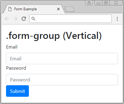
2. Form thẳng đứng (.form-group)
Để bố trí các phần tử nằm theo phương thẳng đứng bạn cần bao bọc (wrap) chúng bởi một thẻ <div class="form-group">. Các phần tử này sẽ có chiều rộng lấp đầy (fill) phần tử cha.
Vertical Form (.form-group)
<form>

   <!-- Vertical -->
   <div class="form-group">
      <label for="myEmail">Email</label>
      <input type="email" id = "myEmail" class="form-control" placeholder="Email">
      <label for="myPassword">Password</label>
      <input type="password" id="myPassword" class="form-control" placeholder="Password">
      <button type="submit" class="btn btn-primary">Submit</button>
   </div>

</form>
Xem ví dụ đầy đủ:
form-group-example.html
<!DOCTYPE html>
<html>
<head>
<meta charset="utf-8">
<title>Form Example</title>
<link rel="stylesheet" href="https://stackpath.bootstrapcdn.com/bootstrap/4.1.1/css/bootstrap.min.css">
</head>
<body>
<div class="container-fluid mt-3">
<h2>.form-group (Vertical)</h2>
<form>
<!-- Vertical -->
<div class="form-group">
<label for="myEmail">Email</label>
<input type="email" id = "myEmail" class="form-control" placeholder="Email">
<label for="myPassword">Password</label>
<input type="password" id="myPassword" class="form-control" placeholder="Password">
<button type="submit" class="btn btn-primary">Submit</button>
</div>
</form>
</div>
<script src="https://code.jquery.com/jquery-3.3.1.slim.min.js"></script>
<script src="https://cdnjs.cloudflare.com/ajax/libs/popper.js/1.14.3/umd/popper.min.js"></script>
<script src="https://stackpath.bootstrapcdn.com/bootstrap/4.1.1/js/bootstrap.min.js"></script>
</body>
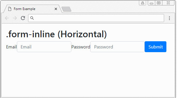
</html>3. Form nằm ngang (.form-inline) **
Để bố trí các phần tử hiển thị trên 1 hàng bạn có thể bao bọc (warp) chúng bởi thẻ <div class="form-inline">. Tuy nhiên chúng có thể nằm trên các dòng khác nhau nếu phần tử cha có chiều rộng quá bé.

Horizontal Form (.form-inline)
<form>
   <!-- Horizontal -->
   <div class="form-inline">
      <label for="myEmail">Email</label>
      <input type="email" id="myEmail" class="form-control" placeholder="Email">
      <label for="myPassword">Password</label>
      <input type="password" id="myPassword" class="form-control" placeholder="Password">
      <button type="submit" class="btn btn-primary">Submit</button>
   </div>
</form>
4. Form Grid
Hệ thống lưới (Grid System) là một hệ thống mạnh mẽ để bố trí các phần tử trên giao diện, và bạn hoàn toàn có thể sử dụng nó để áp dụng cho Form.
Grid
Dưới đây là một ví dụ sử dụng hệ thống lưới để bố trí các phần tử trên giao diện. Chú ý: Lớp .row và .form-row làm việc giống nhau, nhưng lời khuyên là bạn nên sử dụng .form-row để phù hợp với ngữ cảnh.
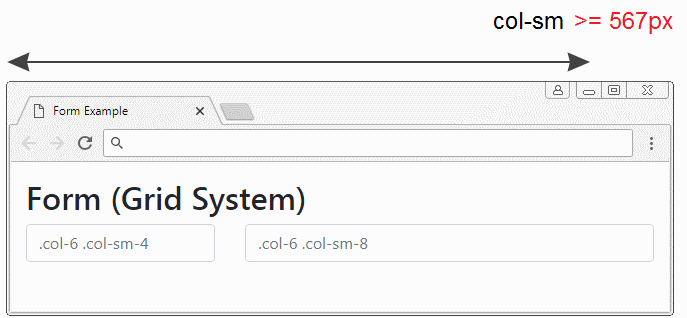
Grid example
<form>
   <div class="row">
      <div class="col-6 col-sm-4">
         <input type="text" class="form-control" placeholder=".col-6 .col-sm-4">
      </div>
      <div class="col-6 col-sm-8">
         <input type="text" class="form-control" placeholder=".col-6 .col-sm-8">
      </div>
   </div>
</form>
Grid + .form-group
Ví dụ kết hợp Grid và lớp .form-group:
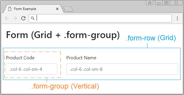
Grid + .form-group example
<form>
   <div class="form-row">
      <div class="col-6 col-sm-4 form-group">
         <label>Product Code</label>
         <input type="text" class="form-control" placeholder=".col-6 .col-sm-4">
      </div>
      <div class="col-6 col-sm-8 form-group">
         <label>Product Name</label>
         <input type="text" class="form-control" placeholder=".col-6 .col-sm-8">
      </div>
   </div>
</form>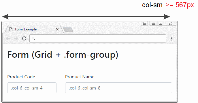
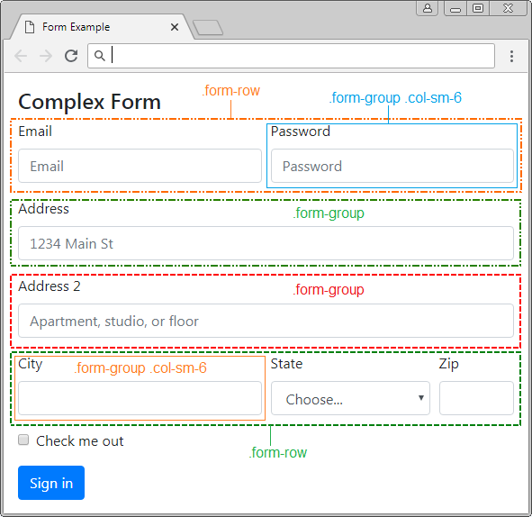
5. Ví dụ Form phức tạp
Kết hợp các lớp .form-group, .form-row, .form-inline,.. để có được một Form với bố trí phức tạp.
complex-form-example.html
<!DOCTYPE html>
<html>
   <head>
      <meta charset="utf-8">
      <title>Form Example</title>
      <link rel="stylesheet" href="https://stackpath.bootstrapcdn.com/bootstrap/4.1.1/css/bootstrap.min.css">
   </head>
   <body>
      <div class="container-fluid mt-3">
         <h4 class="mb-2">Complex Form</h4>
         <form>
            <div class="form-row">
               <div class="form-group col-sm-6">
                  <label for="myEmail">Email</label>
                  <input type="email" class="form-control"
                     id="myEmail" placeholder="Email">
               </div>
               <div class="form-group col-sm-6">
                  <label for="myPassword">Password</label>
                  <input type="password" class="form-control"
                     id="myPassword" placeholder="Password">
               </div>
            </div>
            <div class="form-group">
               <label for="inputAddress">Address</label>
               <input type="text" class="form-control"
                  id="myAddress" placeholder="1234 Main St">
            </div>
            <div class="form-group">
               <label for="inputAddress2">Address 2</label>
               <input type="text" class="form-control"
                  id="myAddress2" placeholder="Apartment, studio, or floor">
            </div>
            <div class="form-row">
               <div class="form-group col-sm-6">
                  <label for="myCity">City</label>
                  <input type="text" class="form-control" id="myCity">
               </div>
               <div class="form-group col-sm-4">
                  <label for="myState">State</label>
                  <select id="myState" class="form-control">
                     <option selected>Choose...</option>
                     <option>...</option>
                  </select>
               </div>
               <div class="form-group col-sm-2">
                  <label for="myZip">Zip</label>
                  <input type="text" class="form-control" id="myZip">
               </div>
            </div>
            <div class="form-group">
               <div class="form-check">
                  <input class="form-check-input" type="checkbox" id="myCheck">
                  <label class="form-check-label" for="myCheck">
                  Check me out
                  </label>
               </div>
            </div>
            <button type="submit" class="btn btn-primary">Sign in</button>
         </form>
      </div>
      <script src="https://code.jquery.com/jquery-3.3.1.slim.min.js"></script>
      <script src="https://cdnjs.cloudflare.com/ajax/libs/popper.js/1.14.3/umd/popper.min.js"></script>
      <script src="https://stackpath.bootstrapcdn.com/bootstrap/4.1.1/js/bootstrap.min.js"></script>
   </body>
</html>
6. HTML Input Types
Phần tử <input> là một trong các thành phần tham gia vào một Form, trước HTML5 có 9 loại <input> là button, checkbox, file, hidden, image, password, radio, reset, submit, text. Tháng 10 năm 2014, HTML5 ra đời, nó giới thiệu thêm 12 kiểu khác của <input> là color, date, datetime-local, email, month, number, range, search, tel, time, url, week. Tất cả các loại này đều được Bootstrap hỗ trợ, và được tạo sẵn các lớp để áp dụng:
Bootstrap Class | Kiểu (Type) | Mô tả |
.btn | button | Định nghĩa một nút có thể nhấn (clickable) |
.btn | reset | Định nghĩa một nút reset (Reset button), để thiết lập lại (reset) các giá trị của Form. |
.btn | submit | Định nghĩa nút submit. |
.form-check-input
.form-check-label | checkbox | Định nghĩa một checkbox. |
.form-check-input
.form-check-label | radio | Định nghĩa một radio button. |
.form-control | text | (Kiểu mặc định). Định nghĩa một trường (field) để nhập vào một dòng văn bản. |
.form-control | password | Định nghĩa một trường để nhập vào mật khẩu. |
.form-control |  email email | Định nghĩa một trường để nhập địa chỉ email. |
.form-control | search | Định nghĩa một trường văn bản để nhập vào từ khóa tìm kiếm. |
.form-control | url | Định nghĩa một trường để nhập vào một URL. |
.form-control | tel | Định nghĩa một trường để nhập vào số điện thoại. |
.form-control | number | Định nghĩa một trường để nhập vào một con số. |
.form-control | color | Định nghĩa một color picker (Bộ chọn mầu) |
.form-control-file | file | Định nghĩa một trường hiển thị file được chọn, và một nút "Browse" để chọn file. |
hidden | Định nghĩa một trường ẩn. | |
image | Định nghĩa một image như là một nút submit. | |
.form-control-range | range | Định nghĩa một control để chọn một giá trị trong một phạm vi (range) (Giống như slider) |
.form-control | date | Định nghĩa một control để chọn ngày tháng (năm, tháng , ngày, không bao gồm thời gian) |
.form-control | time | Định nghĩa một control để chọn thời gian (Không bao gồm múi giờ) |
.form-control | datetime-local | Định nghĩa một control để chọn ngày tháng năm và thời gian (năm, tháng, ngày, thời gian, không bao gồm múi giờ (timezone)) |
.form-control | month | Định nghĩa một control để chọn tháng và năm. |
.form-control | week | Định nghĩa một control để chọn tuần và năm (Không bao gồm múi giờ). |
button, reset, submit
Các phần tử <input type="button|reset|submit"> thực tế là một button, Bootstrap sử dụng lớp .btn để áp dụng cho chúng. Bạn có thể xem chi tiết trong bài học về Bootstrap Button.
text, password, email, search, url, tel, number
Phần tử <input> với các kiểu ở trên là một trường (field) để người dùng nhập vào dữ liệu dạng văn bản (textual). Bootstrap sử dụng lớp .form-control để áp dụng cho các phần tử này.
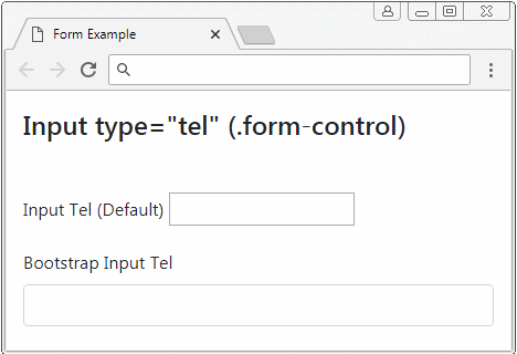
text, password, email, search, url, tel, number
<form>
   <div class="form-group">
      <label for="myTel1">Input Tel (Default)</label>
      <input type="tel" id="myTel1">
   </div>
   <div class="form-group">
      <label for="myTel2">Bootstrap Input Tel</label>
      <input type="tel" id="myTel2" class="form-control">
   </div>
</form>
color
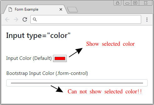
Bootstrap sử dụng lớp .form-control để áp dụng cho <input type="color">. Nhưng có vẻ nó hoạt động không được tốt như mong đợi (Ít nhất là cho đến phiên bản 4.1).
Ví dụ dưới đây là 2 phần tử <input type="color">, một phần tử không được áp dụng lớp .form-control, và một phần tử được áp dụng lớp .form-control:
Dưới đây là một ví dụ đưa ra một giải pháp khắc phục vấn đề nói trên:
input[type=color].form-control {
     height: 40px;
}
input-color-example.html
<!DOCTYPE html>
<html>
   <head>
      <meta charset="utf-8">
      <title>Form Example</title>
      <link rel="stylesheet" href="https://stackpath.bootstrapcdn.com/bootstrap/4.1.1/css/bootstrap.min.css">
      <style>
         input[type=color].form-control {
         height: 40px;
         }
      </style>
   </head>
   <body>
      <div class="container-fluid mt-3">
         <h4 class="mb-5">Input type="color"</h4>
         <form>
            <div class="form-group">
               <label for="myColor1">Input Color (Default)</label>
               <input type="color" id="myColor1">
            </div>
            <div class="form-group">
               <label for="myColor2">Bootstrap Input Color (.form-control)</label>
               <input type="color" class="form-control input-sm" id="myColor2">
            </div>
         </form>
      </div>
      <script src="https://code.jquery.com/jquery-3.3.1.slim.min.js"></script>
      <script src="https://cdnjs.cloudflare.com/ajax/libs/popper.js/1.14.3/umd/popper.min.js"></script>
      <script src="https://stackpath.bootstrapcdn.com/bootstrap/4.1.1/js/bootstrap.min.js"></script>
   </body>
</html>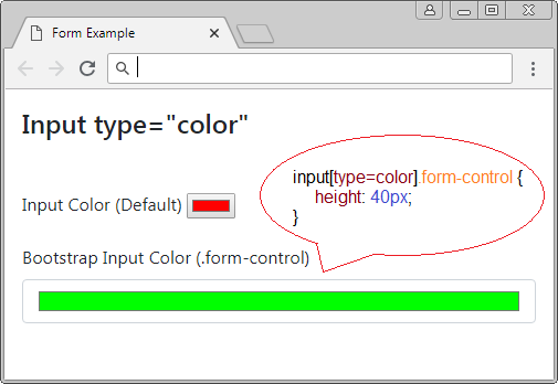
checkbox, radio
Với Bootstrap một thành phần checkbox (Hoặc radio) đầy đủ bao gồm 2 phần tử <input> và <label> được bao bọc (wrap) bởi <div class="form-check">. Bootstrap sử dụng lớp .form-check-input để áp dụng cho <input>, và sử dụng lớp .form-check-label để áp dụng cho <label>.
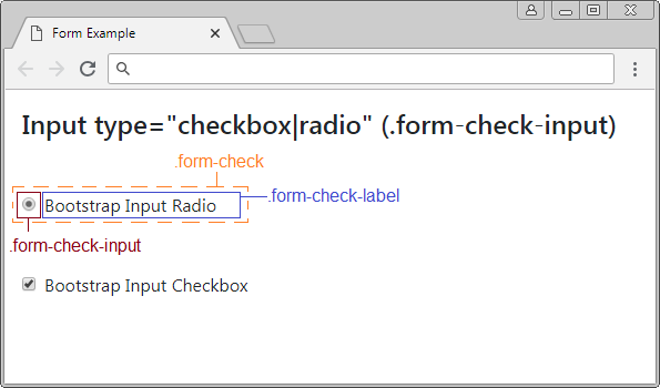
Chú ý: <label> phải được đặt ngay phía sau của <input type="checkbox|radio">.
checkbox/radio
<form>
   <div class="form-group">
      <div class="form-check">
         <input type="radio" id="myRadio1" class="form-check-input">
         <label for="myRadio1">Bootstrap Input Radio</label>
      </div>
   </div>
   <div class="form-group">
      <div class="form-check">
         <input type="checkbox" id="myCheckbox2" class="form-check-input">
         <label for="myCheckbox2" class="form-check-label">Bootstrap Input Checkbox</label>
      </div>
   </div>
</form>
Sử dụng thuộc tính disabled áp dụng cho phần tử <input type="checkbox|radio"> để vô hiệu hóa nó, người dùng sẽ không thể tương tác với phần tử này, đồng thời nó cũng vô hiệu hóa các phần tử <label> trong cùng một .form-check với <input> nói trên.
disabled checkbox/radio
<form>
   <div class="form-check">
      <input class="form-check-input" type="checkbox" value="" id="defaultCheck1">
      <label class="form-check-label" for="defaultCheck1">
      Default checkbox
      </label>
   </div>
   <div class="form-check">
      <input class="form-check-input" type="checkbox" value="" id="defaultCheck2" disabled>
      <label class="form-check-label" for="defaultCheck2"
      Disabled checkbox
      </label>
   </div>
</form>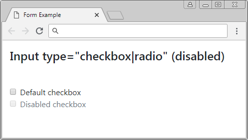
range
<input type="range"> được đưa vào HTML từ phiên bản 5, nó cho phép người dùng lựa chọn một giá trị trong một phạm vi. Bootstrap sử dụng lớp .form-control-range để áp dụng cho phần tử này.
Input range
<form>
   <div class="form-group">
      <label for="myRange1">Input Range (Default)</label>
      <input type="range" id="myRange1" min="5" max="10" step="0.01">
   </div>
   <div class="form-group">
      <label for="myRange2">Bootstrap Input Range</label>
      <input type="range" id="myRange2" min="5" max="10" step="0.01"
         class="form-control-range">
   </div>
</form>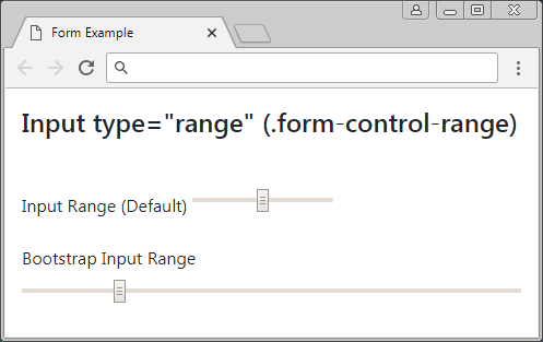
file
<input type="file"> cho phép người dùng lựa chọn một file để upload. Bootstrap sử dụng lớp .form-control-file để áp dụng cho phần tử này.
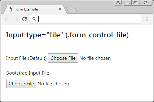
Form file
<form>
   <div class="form-group">
      <label for="myFile1">Input File (Default)</label>
      <input type="file" id="myFile1">
   </div>
   <div class="form-group">
      <label for="myFile2">Bootstrap Input File</label>
      <input type="file" class="form-control-file" id="myFile2">
   </div>
</form>
date, time, datetime-local, week, month
Phiên bản HTML5 đưa vào một số kiểu cho <input> cho phép người dùng nhập vào thông tin liên quan ngày tháng và thời gian. Bootstrap sử dụng lớp .form-control để áp dụng cho các kiểu này.
Input Date
<!DOCTYPE html>
<html>
   <head>
      <meta charset="utf-8">
      <title>Form Example</title>
      <link rel="stylesheet" href="https://stackpath.bootstrapcdn.com/bootstrap/4.1.1/css/bootstrap.min.css">
   </head>
   <body>
      <div class="container-fluid mt-3">
         <h4 class="mb-5">Input type="date" (.form-control)</h4>
         <form>
            <div class="form-group">
               <label for="myDate1">Input Date (Default)</label>
               <input type="date" id="myDate1">
            </div>
            <div class="form-group">
               <label for="myDate2">Bootstrap Input Date</label>
               <input type="date" id="myDate2" class="form-control"
                  min="2018-01-01" max="2018-12-31" value="2018-05-18">
            </div>
         </form>
      </div>
      <script src="https://code.jquery.com/jquery-3.3.1.slim.min.js"></script>
      <script src="https://cdnjs.cloudflare.com/ajax/libs/popper.js/1.14.3/umd/popper.min.js"></script>
      <script src="https://stackpath.bootstrapcdn.com/bootstrap/4.1.1/js/bootstrap.min.js"></script>
   </body>
</html>
<input type="date">
Input Date
<div class="form-group">
   <label for="myDate2">Bootstrap Input Date</label>
   <input type="date" id="myDate2" class="form-control"
      min="2018-01-01" max="2018-12-31" value="2018-05-18">
</div>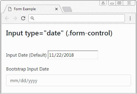
<input type="datetime-local">
Input Datetime-Local
<div class="form-group">
   <label for="myDateTimeLocal2">Bootstrap Input DateTimeLocal</label>
   <input type="datetime-local" id="myDateTimeLocal2" class="form-control"
      min="2018-06-07T00:00" max="2018-06-14T00:00" value="2018-06-08T14:02">
</div>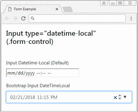
<input type="time">
Input Time
<div class="form-group">
   <label for="myTime2">Bootstrap Input Time</label>
   <input id="myTime2" class="form-control"
      type="time"
      min="9:00" max="18:00" value="13:07">
</div>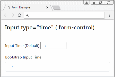
<input type="week">
Input Week
<div class="form-group">
   <label for="myWeek2">Bootstrap Input Week</label>
   <input id="myWeek2" class="form-control"
      type="week"
      min="2018-W27" max="2018-W35" value="2018-W30">
</div>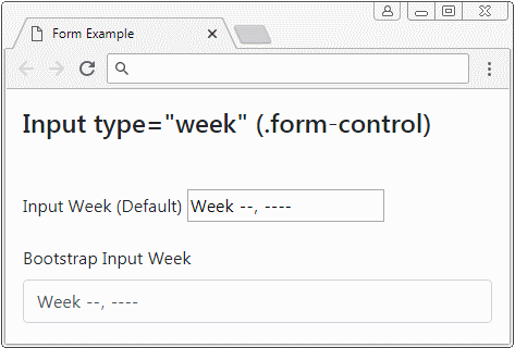
<input type="month">
Input Month
<div class="form-group">
   <label for="myMonth2">Bootstrap Input Month</label>
   <input id="myMonth2" class="form-control"
      type="month"
      min="2018-03" value="2018-05">
</div>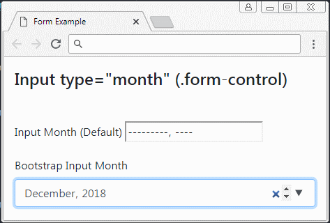
7. Form Textarea, Select
Phần tử <textarea> được sử dụng để tạo ra một vùng cho phép người dùng nhập vào dữ liệu văn bản trên một hoặc nhiều dòng. Bootstrap sử dụng lớp .form-control để áp dụng cho phần tử này.
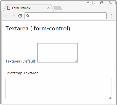
Textarea
<form>
   <div class="form-group">
      <label for="myTextarea1">Textarea (Default)</label>
      <textarea id="myTextarea1" rows="3">Line1<br>Line2</textarea>
   </div>
   <div class="form-group">
      <label for="myTextarea2">Bootstrap Textarea</label>
      <textarea id="myTextarea2" class="form-control" rows="3"></textarea>
   </div>
</form>
Phần tử <select> được sử dụng để tạo ra một danh sách các lựa chọn, và người dùng có thể lựa chọn một hoặc nhiều trong số đó.
Form Select
<form>
   <div class="form-group">
      <label for="mySelect1">Select (Single Select)</label>
      <select id="mySelect1" class="form-control">
         <option value="js">Javascript</option>
         <option value="css">Css</option>
         <option value="bootstrap" selected>Bootstrap</option>
      </select>
   </div>
   <div class="form-group">
      <label for="mySelect2">Select (Multi Select)</label>
      <select id="mySelect2" class="form-control" multiple>
         <option value="js">Javascript</option>
         <option value="css">Css</option>
         <option value="bootstrap" selected>Bootstrap</option>
      </select>
   </div>
</form>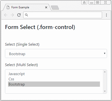
8. Disabled Form
Về cơ bản, bạn có thể sử dụng thuộc tính disabled cho <input>,<texarea>,<select> để vô hiệu hóa chúng. Tuy nhiên nếu bạn muốn vô hiệu hóa tất cả các phần tử này hãy bao bọc (wrap) chúng bởi <fieldset disabled>.
Chú ý: Thuộc tính disabled của <fieldset> có thể không hoạt động với một vài trình duyệt. Chẳng hạn IE phiên bản 11 hoặc cũ hơn. Vì vậy bạn phải sử dụng Javascript tùy biến cho các trình duyệt này.
fieldset disabled
<form>
   <fieldset disabled>
      <div class="form-group">
         <label for="myEmail">Email</label>
         <input type="email" id = "myEmail" class="form-control" placeholder="Email">
         <label for="myPassword">Password</label>
         <input type="password" id="myPassword" class="form-control" placeholder="Password">
         <button type="submit" class="btn btn-primary">Submit</button>
      </div>
   </fieldset>
</form>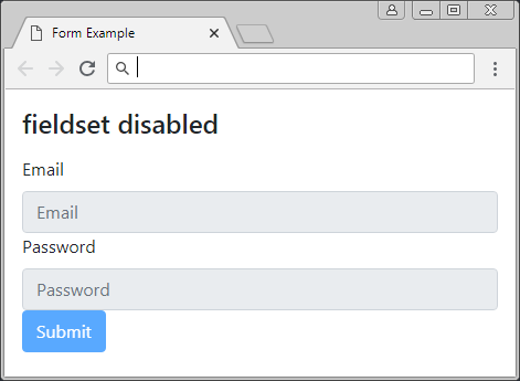
Các hướng dẫn Bootstrap
- Hướng dẫn và ví dụ Bootstrap Jumbotron
- Hướng dẫn và ví dụ Bootstrap Dropdown
- Hướng dẫn và ví dụ Bootstrap Alert
- Hướng dẫn và ví dụ Bootstrap Button
- Hướng dẫn và ví dụ Bootstrap Button Group
- Hướng dẫn và ví dụ Bootstrap Popover (Tooltip)
- Hướng dẫn và ví dụ Bootstrap Spinner
- Giới thiệu về Bootstrap
- Hướng dẫn sử dụng hệ thống lưới trong Bootstrap
- Hướng dẫn và ví dụ Bootstrap Card
- Hướng dẫn và ví dụ Bootstrap Container
- Hướng dẫn và ví dụ Bootstrap Nav, Tab, Pill
- Hướng dẫn và ví dụ Bootstrap NavBar
- Hướng dẫn và ví dụ Bootstrap Table
- Hướng dẫn và ví dụ Bootstrap Modal
- Hướng dẫn và ví dụ Bootstrap Form
- Hướng dẫn và ví dụ Bootstrap Pagination
- Hướng dẫn và ví dụ Bootstrap Badge
- Hướng dẫn và ví dụ Bootstrap Input Group
- Hướng dẫn và ví dụ Bootstrap List Group
- Hướng dẫn và ví dụ Bootstrap ProgressBar
- Hướng dẫn và ví dụ Bootstrap Collapse và Accordion
- Hướng dẫn và ví dụ Bootstrap Scrollspy
- Hướng dẫn và ví dụ Bootstrap Breadcrumb
- Hướng dẫn và ví dụ Bootstrap Carousel
- Hướng dẫn và ví dụ tiện ích Bootstrap Spacing
- Hướng dẫn và ví dụ tiện ích Bootstrap Border
- Hướng dẫn và ví dụ tiện ích Bootstrap Color
- Hướng dẫn và ví dụ tiện ích Bootstrap Text
- Hướng dẫn và ví dụ tiện ích Bootstrap Sizing
- Hướng dẫn và ví dụ tiện ích Bootstrap Position
- Hướng dẫn và ví dụ tiện ích Bootstrap Flex
- Hướng dẫn và ví dụ tiện ích Bootstrap Display
- Hướng dẫn và ví dụ tiện ích Bootstrap Visibility
- Hướng dẫn và ví dụ tiện ích Bootstrap Embed
Show More