Hướng dẫn và ví dụ Bootstrap ProgressBar
1. Progress Bar
Progress Bar (Thanh tiến trình) là một thành phần giao diện trực quan để mô tả tiến độ của một công việc, chẳng hạn như tiến trình download, tiến trình cài đặt. Progress Bar cho phép người dùng biết được phần trăm hoàn thành công việc, và ước lượng thời gian công việc sẽ hoàn thành.
Bootstrap cung cấp một vài lớp để bạn xây dựng một Progress Bar.
- .progress-bar: Lớp này sử dụng cho phần tử (element) biểu thị tiến độ công việc hiện tại.
- .progress: Lớp này sử dụng cho phần tử bao bọc (wrap) phần tử .progress-bar, nó biểu thị giá trị tối đa của thanh tiến trình.
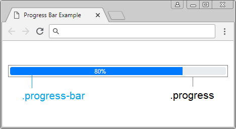
<div class="progress">

   <div class="progress-bar"
      role="progressbar"
      aria-valuenow="80"
      aria-valuemin="0" aria-valuemax="100"
      style="width:80%">
      80%
   </div>

</div>
Giải thích về code:
Thuộc tính (Attribute) | Mô tả |
aria-valuemin aria-valuemax aria-valuenow | Giá trị nhỏ nhất, giá trị lớn nhất và giá trị hiện tại của tiến trình (progress). Các thuộc tính này không có tác dụng để hiển thị độ dài của progress-bar mà bạn nhìn thấy trên giao diện. Nhưng các thuộc tính này cho phép bạn lấy được các giá trị thông qua Javascript. |
style="width:80%" | Đây là cách để hiển thị độ dài (phần trăm) của progress-bar mà bạn nhìn thấy trên giao diện. |
Xem ví dụ đầy đủ:
progressbar-example.html
<!DOCTYPE html>
<html>
   <head>
      <meta charset="utf-8">
      <title>Progress Bar Example</title>
      <link rel="stylesheet" href="https://stackpath.bootstrapcdn.com/bootstrap/4.1.1/css/bootstrap.min.css">
   </head>
   <body>
      <div class="container mt-3">
         <h4>Progress Bar:</h4>

         <div class="progress">
            <div class="progress-bar" role="progressbar"
               aria-valuenow="80"
               aria-valuemin="0" aria-valuemax="100"
               style="width:80%">
               80%
            </div>
         </div>

      </div>

      <script src="https://code.jquery.com/jquery-3.3.1.slim.min.js"></script>
      <script src="https://cdnjs.cloudflare.com/ajax/libs/popper.js/1.14.3/umd/popper.min.js"></script>
      <script src="https://stackpath.bootstrapcdn.com/bootstrap/4.1.1/js/bootstrap.min.js"></script>
   </body>
</html>
Colors:
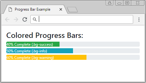
Bạn có thể áp dụng mầu nền cho Progress-bar, dưới đây là danh sách các mầu nền được định nghĩa sẵn của Bootstrap.
- bg-primary
- bg-secondary
- bg-success
- bg-danger
- bg-warning
- bg-info
- bg-light
- bg-dark
- bg-muted
- bg-white
colored-progressbar-example.html
<!DOCTYPE html>
<html>
   <head>
      <meta charset="utf-8">
      <title>Progress Bar Example</title>
      <link rel="stylesheet" href="https://stackpath.bootstrapcdn.com/bootstrap/4.1.1/css/bootstrap.min.css">
      <style>
      .progress {
         margin: 5px 0px;
      }
      </style>
   </head>
   <body>
      <div class="container mt-3">
         <h4>Colored Progress Bars:</h4>

         <div class="progress">
            <div class="progress-bar bg-success text-left"
               role="progressbar" aria-valuenow="40" aria-valuemin="0" aria-valuemax="100" style="width:40%">
               40% Complete (.bg-success)
            </div>
         </div>

         <div class="progress">
            <div class="progress-bar bg-info text-left"
               role="progressbar" aria-valuenow="50" aria-valuemin="0" aria-valuemax="100" style="width:50%">
               50% Complete (.bg-info)
            </div>
         </div>

         <div class="progress">
            <div class="progress-bar bg-warning text-left"
               role="progressbar" aria-valuenow="60" aria-valuemin="0" aria-valuemax="100" style="width:60%">
               60% Complete (.bg-warning)
            </div>
         </div>

      </div>

      <script src="https://code.jquery.com/jquery-3.3.1.slim.min.js"></script>
      <script src="https://cdnjs.cloudflare.com/ajax/libs/popper.js/1.14.3/umd/popper.min.js"></script>
      <script src="https://stackpath.bootstrapcdn.com/bootstrap/4.1.1/js/bootstrap.min.js"></script>

   </body>
</html>
Height:
Bạn chỉ cần thiết lập chiều cao cho .progress, tất cả các .progress-bar bên trong cũng sẽ tự động được thay đổi chiều cao.
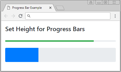
Set Height for Progress
<div class="progress" style="height:5px;">
   <div class="progress-bar bg-success" role="progressbar"
      aria-valuenow="80"
      aria-valuemin="0" aria-valuemax="100"
      style="width:80%">
   </div>
</div>

<br>

<div class="progress" style="height:55px;">
   <div class="progress-bar" role="progressbar"
      aria-valuenow="30"
      aria-valuemin="0" aria-valuemax="100"
      style="width:30%">
   </div>
</div>
2. Striped Progress Bar
Sử dụng lớp .striped-progress-bar cùng với .progress-bar bạn sẽ có được một thanh tiến trình (progress bar) với các kẻ sọc (Stripe)
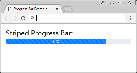
Striped Progress Bar
<div class="progress">

   <div class="progress-bar progress-bar-striped" role="progressbar"
      aria-valuenow="80"
      aria-valuemin="0" aria-valuemax="100"
      style="width:80%">
      80%
   </div>

</div>
Kết hợp 2 lớp .progress-bar-striped & .progress-bar-animated, bạn có thể tạo được một thanh tiến trình với hiệu ứng hoạt hình.
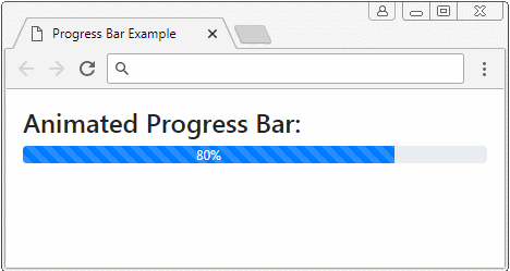
Animated Progress Bar
<div class="progress">

   <div class="progress-bar progress-bar-striped progress-bar-animated"
      role="progressbar"
      aria-valuenow="80"
      aria-valuemin="0" aria-valuemax="100"
      style="width:80%">
      80%
   </div>

</div>
3. Stacked Progress Bar
Các thanh tiến trình (progress-bar) cũng có thể được xếp chồng (stack) nên nhau. Nó giống như hình minh họa dưới đây.
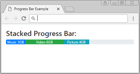
Stacked Progress Bar
<div class="progress">

   <div class="progress-bar" role="progressbar" style="width: 15%"
      aria-valuenow="15" aria-valuemin="0" aria-valuemax="100">
      Music 3GB
   </div>

   <div class="progress-bar bg-success" role="progressbar" style="width: 30%"
      aria-valuenow="30" aria-valuemin="0" aria-valuemax="100">
      Video 6GB
   </div>

   <div class="progress-bar bg-info" role="progressbar" style="width: 20%"
      aria-valuenow="20" aria-valuemin="0" aria-valuemax="100">
      Picture 4GB
   </div>

</div>
Các hướng dẫn Bootstrap
- Hướng dẫn và ví dụ Bootstrap Jumbotron
- Hướng dẫn và ví dụ Bootstrap Dropdown
- Hướng dẫn và ví dụ Bootstrap Alert
- Hướng dẫn và ví dụ Bootstrap Button
- Hướng dẫn và ví dụ Bootstrap Button Group
- Hướng dẫn và ví dụ Bootstrap Popover (Tooltip)
- Hướng dẫn và ví dụ Bootstrap Spinner
- Giới thiệu về Bootstrap
- Hướng dẫn sử dụng hệ thống lưới trong Bootstrap
- Hướng dẫn và ví dụ Bootstrap Card
- Hướng dẫn và ví dụ Bootstrap Container
- Hướng dẫn và ví dụ Bootstrap Nav, Tab, Pill
- Hướng dẫn và ví dụ Bootstrap NavBar
- Hướng dẫn và ví dụ Bootstrap Table
- Hướng dẫn và ví dụ Bootstrap Modal
- Hướng dẫn và ví dụ Bootstrap Form
- Hướng dẫn và ví dụ Bootstrap Pagination
- Hướng dẫn và ví dụ Bootstrap Badge
- Hướng dẫn và ví dụ Bootstrap Input Group
- Hướng dẫn và ví dụ Bootstrap List Group
- Hướng dẫn và ví dụ Bootstrap ProgressBar
- Hướng dẫn và ví dụ Bootstrap Collapse và Accordion
- Hướng dẫn và ví dụ Bootstrap Scrollspy
- Hướng dẫn và ví dụ Bootstrap Breadcrumb
- Hướng dẫn và ví dụ Bootstrap Carousel
- Hướng dẫn và ví dụ tiện ích Bootstrap Spacing
- Hướng dẫn và ví dụ tiện ích Bootstrap Border
- Hướng dẫn và ví dụ tiện ích Bootstrap Color
- Hướng dẫn và ví dụ tiện ích Bootstrap Text
- Hướng dẫn và ví dụ tiện ích Bootstrap Sizing
- Hướng dẫn và ví dụ tiện ích Bootstrap Position
- Hướng dẫn và ví dụ tiện ích Bootstrap Flex
- Hướng dẫn và ví dụ tiện ích Bootstrap Display
- Hướng dẫn và ví dụ tiện ích Bootstrap Visibility
- Hướng dẫn và ví dụ tiện ích Bootstrap Embed
Show More