Hướng dẫn và ví dụ Bootstrap Alert
1. Bootstrap Alert
Alert là một thành phần giao diện được xây dựng sẵn của Bootstrap, nó là một vùng không gian trang (page) hiển thị một thông diệp (message), thông điệp có thể là một thông tin hoặc một cảnh báo lỗi, ... (info, warning, danger,..).
Khác với thành phần Model, Alert không hiển thị như một cửa sổ, nó là một vùng trên trang nhưng có thể có nút "x" giúp bạn có thể đóng vùng không gian này lại.
Khác với thành phần Model, Alert không hiển thị như một cửa sổ, nó là một vùng trên trang nhưng có thể có nút "x" giúp bạn có thể đóng vùng không gian này lại.
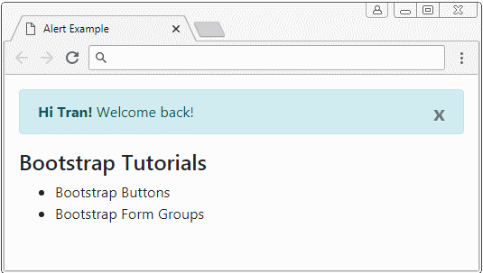
alert-example.html
<!DOCTYPE html>
<html>
   <head>
      <meta charset="utf-8">
      <title>Alert Example</title>
      <link rel="stylesheet" href="https://maxcdn.bootstrapcdn.com/bootstrap/4.0.0/css/bootstrap.min.css">
   </head>
   <body>
      <div class="container mt-3">

         <div class="alert alert-info">
            <strong>Hi Tran!</strong> Welcome back!
            <button type="button" class="close" data-dismiss="alert" aria-label="Close">x</button>
         </div>


         <h4>Bootstrap Tutorials</h4>
         <ul>
            <li>Bootstrap Buttons</li>
            <li>Bootstrap Form Groups</li>
         </ul>
      </div>

      <script src="https://code.jquery.com/jquery-3.2.1.slim.min.js"></script>
      <script src="https://cdnjs.cloudflare.com/ajax/libs/popper.js/1.12.9/umd/popper.min.js"></script>
      <script src="https://maxcdn.bootstrapcdn.com/bootstrap/4.0.0/js/bootstrap.min.js"></script>

   </body>
</html>
Sử dụng lớp .alert kết hợp với một trong các lớp .alert-info, .alert-warning, .alert-danger, .. để tạo ra một Alert phù hợp với ngữ cảnh của bạn.
<div class="alert alert-primary">.alert-primary</div>
<div class="alert alert-secondary">.alert-secondary</div>
<div class="alert alert-success">.alert-success</div>
<div class="alert alert-danger">.alert-danger</div>
<div class="alert alert-warning">.alert-warning</div>
<div class="alert alert-info">.alert-info</div>
<div class="alert alert-dark">.alert-dark</div>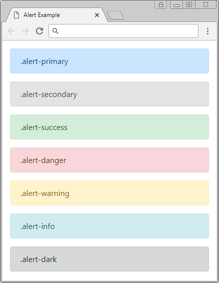
.alert-link
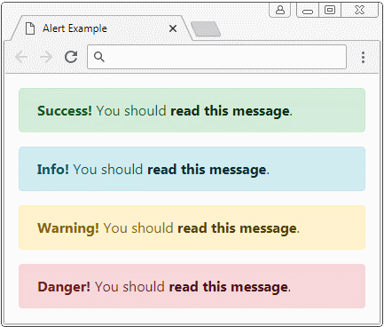
Có thể bên trong một Alert bạn có sử dụng các thẻ (tag) <a>, bạn nên sử dụng lớp .alert-link cho thẻ này. Lớp .alert-link sẽ thiết lập mầu sắc cho thẻ <a> khớp với ngữ cảnh của Alert.
.alert-link
<div class="alert alert-success">
   <strong>Success!</strong> You should <a href="#" class="alert-link">read this message</a>.
</div>
<div class="alert alert-info">
   <strong>Info!</strong> You should <a href="#" class="alert-link">read this message</a>.
</div>
<div class="alert alert-warning">
   <strong>Warning!</strong> You should <a href="#" class="alert-link">read this message</a>.
</div>
<div class="alert alert-danger">
   <strong>Danger!</strong> You should <a href="#" class="alert-link">read this message</a>.
</div>
2. Alert với nút đóng
Để tạo một Alert có thể đóng được (closable), bạn cần sử dụng lớp .alert-dismissible cho Alert, và thêm các thuộc tính (attribute): class="close" data-dismiss="alert" cho nút đóng. Nút đóng sẽ hiển thị ở góc trên bên phải của Alert, khi người dùng nhấn vào nút này Alert sẽ được ẩn đi.

closing-alert-example.html
<!DOCTYPE html>
<html>
<head>
<meta charset="utf-8">
<title>Alert Example</title>
<link rel="stylesheet" href="https://maxcdn.bootstrapcdn.com/bootstrap/4.0.0/css/bootstrap.min.css">
</head>
<body>
<div class="container mt-3">
<div class="alert alert-info alert-dismissible">
<strong>Hi Tran!</strong> Welcome back!
<button type="button" class="close" data-dismiss="alert" aria-label="Close">×</button>
</div>
<h4>Bootstrap Tutorials</h4>
<ul>
<li>Bootstrap Buttons</li>
<li>Bootstrap Form Groups</li>
</ul>
</div>
<script src="https://code.jquery.com/jquery-3.2.1.slim.min.js"></script>
<script src="https://cdnjs.cloudflare.com/ajax/libs/popper.js/1.12.9/umd/popper.min.js"></script>
<script src="https://maxcdn.bootstrapcdn.com/bootstrap/4.0.0/js/bootstrap.min.js"></script>
</body>Class/Attribute | Mô tả |
.alert-dismissible | Bạn có thể không cần tới lớp này, vì nó không ảnh hưởng đến việc Alert có thể đóng được hay không. Nhưng nó giúp thiết lập padding cho .close. |
data-dismiss="alert" | Thuộc tính này cần được thêm vào cho nút đóng (x), Bootstrap tự động đăng ký hàm xử lý cho sự kiện người dùng nhấn vào nút này. Khi người dùng nhấn vào nút đóng (x), Alert sẽ được ẩn đi. |
3. Tùy biến Alert
Bạn có thể tạo ra một Alert tùy biến, với nội dung HTML phức tạp, hãy nhớ rằng Bootstrap cung cấp cho bạn một lớp .alert-heading để áp dụng cho "phần mở đầu" (heading) của Alert.
.alert-heading
<div class="alert alert-success" role="alert">
   <h4 class="alert-heading">Well done!</h4>
   <p>Aww yeah, you successfully read this important alert message.
      This example text is going to run a bit longer
       so that you can see how spacing within an alert works with this kind of content.
   </p>
   <hr>
   <p class="mb-0">Whenever you need to,
       be sure to use margin utilities to keep things nice and tidy.</p>
</div>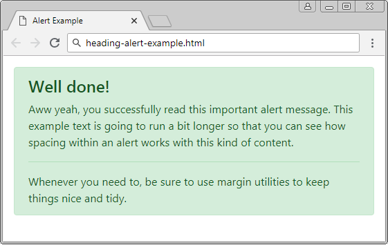
Các hướng dẫn Bootstrap
- Hướng dẫn và ví dụ Bootstrap Jumbotron
- Hướng dẫn và ví dụ Bootstrap Dropdown
- Hướng dẫn và ví dụ Bootstrap Alert
- Hướng dẫn và ví dụ Bootstrap Button
- Hướng dẫn và ví dụ Bootstrap Button Group
- Hướng dẫn và ví dụ Bootstrap Popover (Tooltip)
- Hướng dẫn và ví dụ Bootstrap Spinner
- Giới thiệu về Bootstrap
- Hướng dẫn sử dụng hệ thống lưới trong Bootstrap
- Hướng dẫn và ví dụ Bootstrap Card
- Hướng dẫn và ví dụ Bootstrap Container
- Hướng dẫn và ví dụ Bootstrap Nav, Tab, Pill
- Hướng dẫn và ví dụ Bootstrap NavBar
- Hướng dẫn và ví dụ Bootstrap Table
- Hướng dẫn và ví dụ Bootstrap Modal
- Hướng dẫn và ví dụ Bootstrap Form
- Hướng dẫn và ví dụ Bootstrap Pagination
- Hướng dẫn và ví dụ Bootstrap Badge
- Hướng dẫn và ví dụ Bootstrap Input Group
- Hướng dẫn và ví dụ Bootstrap List Group
- Hướng dẫn và ví dụ Bootstrap ProgressBar
- Hướng dẫn và ví dụ Bootstrap Collapse và Accordion
- Hướng dẫn và ví dụ Bootstrap Scrollspy
- Hướng dẫn và ví dụ Bootstrap Breadcrumb
- Hướng dẫn và ví dụ Bootstrap Carousel
- Hướng dẫn và ví dụ tiện ích Bootstrap Spacing
- Hướng dẫn và ví dụ tiện ích Bootstrap Border
- Hướng dẫn và ví dụ tiện ích Bootstrap Color
- Hướng dẫn và ví dụ tiện ích Bootstrap Text
- Hướng dẫn và ví dụ tiện ích Bootstrap Sizing
- Hướng dẫn và ví dụ tiện ích Bootstrap Position
- Hướng dẫn và ví dụ tiện ích Bootstrap Flex
- Hướng dẫn và ví dụ tiện ích Bootstrap Display
- Hướng dẫn và ví dụ tiện ích Bootstrap Visibility
- Hướng dẫn và ví dụ tiện ích Bootstrap Embed
Show More