Hướng dẫn và ví dụ Bootstrap Popover (Tooltip)
1. PopOver
PopOver là một thành phần giao diện, nó hiển thị để chú thích (hoặc gợi ý) cho một thành phần nào đó trên giao diện. Nó tương tự như khái niệm Tooltip trong các thư viện khác.
PopOver là một thư viện Javascript được phát triển bởi bên thứ ba (3rd party), nó được tích hợp vào Bootstrap như một Plugin.
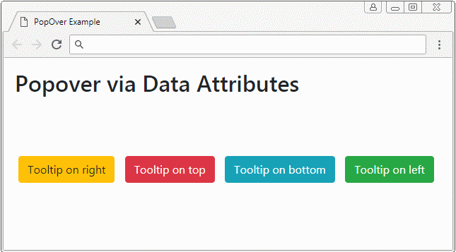
popover
<button type="button" class="btn btn-warning myPopover"
   data-toggle="popover"
   data-placement="right" title="Right Popover"
   data-content="Popover show on Right">Tooltip on right</button>

...

<script>
   $(function(){
      $(".myPopover").popover();
   });
</script>
popover-example.html
<!DOCTYPE html>
<html>
   <head>
      <meta charset="utf-8">
      <title>PopOver Example</title>
      <link rel="stylesheet" href="https://maxcdn.bootstrapcdn.com/bootstrap/4.0.0/css/bootstrap.min.css">
      <style>
         .btn {margin: 5px;}
      </style>
   </head>
   <body>
      <div class="container-fluid mt-3">
         <h2>Popover via Data Attributes</h2>
         <br><br><br>

         <button type="button" class="btn btn-warning myPopover"
            data-toggle="popover"
            data-placement="right" title="Right Popover"
            data-content="Popover show on Right">Tooltip on right</button>

         <button type="button" class="btn btn-danger myPopover"
            data-toggle="popover"
            data-placement="top" title="Top Popover"
            data-content="Popover show on top.">Tooltip on top</button>

         <button type="button" class="btn btn-info myPopover"
            data-toggle="popover"
            data-placement="bottom" title="Bottom Popover"
            data-content="Popover show on Bottom.">Tooltip on bottom</button>

         <button type="button" class="btn btn-success myPopover"
            data-toggle="popover"
            data-placement="left" title="Left Popover"
            data-content="Popover show on Left">Tooltip on left</button>

      </div>
      <script src="https://code.jquery.com/jquery-3.2.1.slim.min.js"></script>
      <script src="https://cdnjs.cloudflare.com/ajax/libs/popper.js/1.12.9/umd/popper.min.js"></script>
      <script src="https://maxcdn.bootstrapcdn.com/bootstrap/4.0.0/js/bootstrap.min.js"></script>

      <script>
         $(function(){
            $(".myPopover").popover();
         });
      </script>

   </body>
</html>
2. PopOver (Focus)
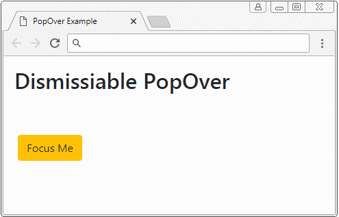
Một trong các hành vi của Popover là hiển thị khi người dùng "focus" (tập trung) vào phần tử sở hữu nó. Và tự động ẩn khi người dùng "focus" sang phần tử khác. Chẳng hạn người dùng nhấn vào một phần tử và Popover của phần tử này sẽ hiển thị, khi người dùng nhấn sang một nơi khác Popover sẽ tự động ẩn đi. Điều này có được bằng cách thiết lập thuộc tính data-trigger="focus" cho phần tử.
<button type="button"
   class="btn btn-warning myPopover"
   data-toggle="popover"
   data-placement="right" title="Dismissiabe Popover"
   data-trigger="focus"
   data-content="I display when the button is focused!">Focus Me</button>

<script>
   $('.myPopover').popover();
</script>
Xem ví dụ đầy đủ:
dismissiable-popover-example.html
<!DOCTYPE html>
<html>
   <head>
      <meta charset="utf-8">
      <title>PopOver Example</title>
      <link rel="stylesheet" href="https://maxcdn.bootstrapcdn.com/bootstrap/4.0.0/css/bootstrap.min.css">
      <style>
         .btn {margin: 5px;}
      </style>
   </head>
   <body>
      <div class="container-fluid mt-3">
         <h2>Dismissiable PopOver</h2>
         <br><br>

         <button type="button"
            class="btn btn-warning myPopover"
            data-toggle="popover"
            data-placement="right" title="Dismissiabe Popover"
            data-trigger="focus"
            data-content="I display when the button is focused!">Focus Me</button>

      </div>

      <script src="https://code.jquery.com/jquery-3.2.1.slim.min.js"></script>
      <script src="https://cdnjs.cloudflare.com/ajax/libs/popper.js/1.12.9/umd/popper.min.js"></script>
      <script src="https://maxcdn.bootstrapcdn.com/bootstrap/4.0.0/js/bootstrap.min.js"></script>

      <script>
          $('.myPopover').popover();
      </script>

   </body>
</html>
3. Popover (Hover)
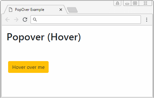
Bằng cách thiết lập thuộc tính data-trigger="hower", khi con trỏ di chuyển trên (over) phần tử Popover sẽ hiển thị, và khi con trỏ thoát ra khỏi phần tử Popover sẽ ẩn đi.
<button type="button"
   class="btn btn-warning myPopover"
   data-toggle="popover"
   data-placement="right" title="Hover Popover"
   data-trigger="hover"
   data-content="I display when pointer over the element">Hower over Me</button>


<script>
   $('.myPopover').popover();
</script>
Ví dụ đầy đủ:
hover-popover-example.html
<!DOCTYPE html>
<html>
   <head>
      <meta charset="utf-8">
      <title>PopOver Example</title>
      <link rel="stylesheet" href="https://maxcdn.bootstrapcdn.com/bootstrap/4.0.0/css/bootstrap.min.css">
      <style>
         .btn {margin: 5px;}
      </style>
   </head>
   <body>
      <div class="container-fluid mt-3">
         <h2>Popover (Hover)</h2>
         <br><br>

         <button type="button"
            class="btn btn-warning myPopover"
            data-toggle="popover"
            data-placement="right" title="Hover Popover"
            data-trigger="hover"
            data-content="I display when pointer over the element">Hover over me</button>

      </div>

      <script src="https://code.jquery.com/jquery-3.2.1.slim.min.js"></script>
      <script src="https://cdnjs.cloudflare.com/ajax/libs/popper.js/1.12.9/umd/popper.min.js"></script>
      <script src="https://maxcdn.bootstrapcdn.com/bootstrap/4.0.0/js/bootstrap.min.js"></script>

      <script>
          $('.myPopover').popover();
      </script>

   </body>
</html>
4. Popover với nội dung HTML
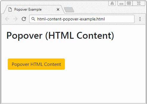
Theo mặc định Popover hiển thị nội dung văn bản (text), mặc dù có thể nội dung mà bạn cung cấp là HTML. Bởi vì jQuery đã chuyển đổi HTML thành Text trước khi hiển thị (Phương thức text đã được gọi để chuyển HTML thành Text). Vì vậy bạn cần thêm thuộc tính data-html=true để nói với Popover plugin rằng hãy hiển thị nội dung dưới dạng HTML.
Popover with HTML Content
<button type="button"
   class="btn btn-warning myPopover"
   data-toggle="popover"
   data-placement="right" title="Popover with HTML content"
   data-trigger="hover"
   data-html="true"
   data-content="This is <b style='color:red;'>Simple</b> HTML Content.">Popover HTML Content</button>

<script>
   $('.myPopover').popover();
</script>
Nếu bạn muốn có một Popover với nội dung HTML dài, thì dưới đây là một ví dụ tốt hơn:
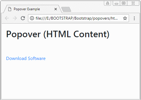
html-content-popover-example2.html
<!DOCTYPE html>
<html>
   <head>
      <meta charset="utf-8">
      <title>Popover Example</title>
      <link rel="stylesheet" href="https://maxcdn.bootstrapcdn.com/bootstrap/4.0.0/css/bootstrap.min.css">
      <style>
         .btn {margin: 5px;}
      </style>
   </head>
   <body>
      <div class="container-fluid mt-3">
         <h2>Popover (HTML Content)</h2>
         <br><br>
         <a href="#"
            class="myPopover"
            data-toggle="popover"
            data-placement="right" title="Quick guide"
            data-trigger="hover"
            data-html="true"
            data-popover-content="#myPopoverContent">Download Software</a>

         <!-- Content for Popover: -->
         <div id="myPopoverContent" style="display:none">
            <strong>Steps to do..</strong>
            <ol style="padding:10px">
               <li>Download this file</li>
               <li>Install the software</li>
               <li>Restart your computer</li>
            </ol>
         </div>

      </div>

      <script src="https://code.jquery.com/jquery-3.2.1.slim.min.js"></script>
      <script src="https://cdnjs.cloudflare.com/ajax/libs/popper.js/1.12.9/umd/popper.min.js"></script>
      <script src="https://maxcdn.bootstrapcdn.com/bootstrap/4.0.0/js/bootstrap.min.js"></script>

      <script>
         $('.myPopover').popover({
         html : true,
         content: function() {
          var elementId = $(this).attr("data-popover-content");
          return $(elementId).html();
         }
         });
      </script>
   </body>
</html>
Các hướng dẫn Bootstrap
- Hướng dẫn và ví dụ Bootstrap Jumbotron
- Hướng dẫn và ví dụ Bootstrap Dropdown
- Hướng dẫn và ví dụ Bootstrap Alert
- Hướng dẫn và ví dụ Bootstrap Button
- Hướng dẫn và ví dụ Bootstrap Button Group
- Hướng dẫn và ví dụ Bootstrap Popover (Tooltip)
- Hướng dẫn và ví dụ Bootstrap Spinner
- Giới thiệu về Bootstrap
- Hướng dẫn sử dụng hệ thống lưới trong Bootstrap
- Hướng dẫn và ví dụ Bootstrap Card
- Hướng dẫn và ví dụ Bootstrap Container
- Hướng dẫn và ví dụ Bootstrap Nav, Tab, Pill
- Hướng dẫn và ví dụ Bootstrap NavBar
- Hướng dẫn và ví dụ Bootstrap Table
- Hướng dẫn và ví dụ Bootstrap Modal
- Hướng dẫn và ví dụ Bootstrap Form
- Hướng dẫn và ví dụ Bootstrap Pagination
- Hướng dẫn và ví dụ Bootstrap Badge
- Hướng dẫn và ví dụ Bootstrap Input Group
- Hướng dẫn và ví dụ Bootstrap List Group
- Hướng dẫn và ví dụ Bootstrap ProgressBar
- Hướng dẫn và ví dụ Bootstrap Collapse và Accordion
- Hướng dẫn và ví dụ Bootstrap Scrollspy
- Hướng dẫn và ví dụ Bootstrap Breadcrumb
- Hướng dẫn và ví dụ Bootstrap Carousel
- Hướng dẫn và ví dụ tiện ích Bootstrap Spacing
- Hướng dẫn và ví dụ tiện ích Bootstrap Border
- Hướng dẫn và ví dụ tiện ích Bootstrap Color
- Hướng dẫn và ví dụ tiện ích Bootstrap Text
- Hướng dẫn và ví dụ tiện ích Bootstrap Sizing
- Hướng dẫn và ví dụ tiện ích Bootstrap Position
- Hướng dẫn và ví dụ tiện ích Bootstrap Flex
- Hướng dẫn và ví dụ tiện ích Bootstrap Display
- Hướng dẫn và ví dụ tiện ích Bootstrap Visibility
- Hướng dẫn và ví dụ tiện ích Bootstrap Embed
Show More