Hướng dẫn và ví dụ tiện ích Bootstrap Embed
1. Bootstrap Embed
Đôi khi bạn cần nhúng một nội dung đa phương tiện (media) vào trong trang HTML, chẳng hạn Video, PDF,... Nó có thể không phù hợp với tất cả các loại thiết bị có độ rộng màn hình khác nhau. Vì vậy Bootstrap đưa ra các lớp tiện ích để giải quyết vấn đề này.
<object> / PDF ...
Đây là một ví dụ đơn giản sử dụng <object> để nhúng một tập tin PDF vào trang HTML, nhưng cửa sổ hiển thị PDF không co giãn phù hợp với khung nhìn (viewport) của trình duyệt.
object-pdf-non-responsive-example.html
<!DOCTYPE html>
<html>
   <head>
      <meta charset="utf-8">
      <title>HTML object PDF</title>
   </head>
   <body>
      <h3 class="mb-3">Non-Responsive object PDF</h3>

      <object data="example.pdf" type="application/pdf" internalinstanceid="9" title="">
         <p>
            Your browser isn't supporting embedded pdf files.
            You can download the file
            <a href="example.pdf">here</a>.
         </p>
      </object>

   </body>
</html>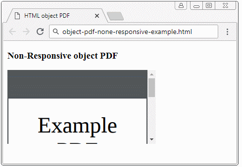
<iframe> / video ...
Và một ví dụ đơn giản khác sử dụng <iframe> để hiển thị một Video trên trang HTML. Cũng giống như ví dụ PDF ở trên, video hiển thị không tương thích đối với các thiết bị khác nhau.
iframe-non-responsive-example.html
<!DOCTYPE html>
<html>
   <head>
      <meta charset="utf-8">
      <title>HTML iframe</title>
   </head>
   <body>
      <h3 class="mb-3">Non-Responsive iframe</h3>

      <iframe
         src="https://www.youtube.com/embed/zpOULjyy-n8?rel=0" allowfullscreen>
      </iframe>

   </body>
</html>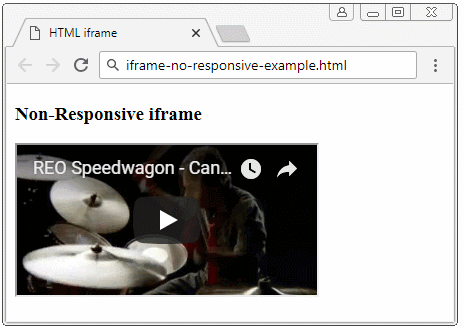
Và đây là giải pháp của Bootstrap:
- Bao bọc (wrap) <iframe>/<object>/.. bởi <div class="embed-responsive embed-responsive-*by*">. Trong đó: (*) là một con số, tôi sẽ giải thích chi tiết hơn về nó ở bên dưới.
- Áp dụng lớp .embed-responsive-item cho <iframe>/<object>/...
<!-- object/ PDF ... -->
<div class="embed-responsive embed-responsive-16by9">
   <object class="embed-responsive-item" data="example.pdf"
      type="application/pdf" internalinstanceid="9" title="">
      <p>
         Your browser isn't supporting embedded pdf files. You can download the file
         <a href="example.pdf">here</a>
      </p>
   </object>
</div>

<!-- iframe/ Video ... -->
<div class="embed-responsive embed-responsive-16by9">
   <iframe class="embed-responsive-item"
      src="https://www.youtube.com/embed/zpOULjyy-n8?rel=0" allowfullscreen>
   </iframe>
</div>
Và kết quả thực sự là không tệ!
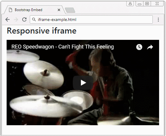
iframe-example.html
<!DOCTYPE html>
<html>
   <head>
      <meta charset="utf-8">
      <title>Bootstrap Embed</title>
      <link rel="stylesheet" href="https://stackpath.bootstrapcdn.com/bootstrap/4.1.1/css/bootstrap.min.css">
   </head>
   <body>
      <h3 class="mb-3">Responsive iframe</h3>

      <div class="embed-responsive embed-responsive-16by9">
         <iframe class="embed-responsive-item"
            src="https://www.youtube.com/embed/zpOULjyy-n8?rel=0" allowfullscreen>
         </iframe>
      </div>

      <script src="https://code.jquery.com/jquery-3.3.1.slim.min.js"></script>
      <script src="https://cdnjs.cloudflare.com/ajax/libs/popper.js/1.14.3/umd/popper.min.js"></script>
      <script src="https://stackpath.bootstrapcdn.com/bootstrap/4.1.1/js/bootstrap.min.js"></script>
   </body>
</html>
.embed-responsive-*by*
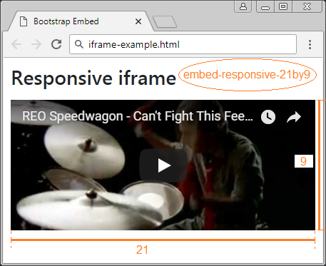
Có một vài lớp được Bootstrap xây dựng sẵn để thiết lập tỷ lệ giữa chiều rộng và chiều cao của media.
- embed-responsive-21by9
- embed-responsive-16by9
- embed-responsive-4by3
- embed-responsive-1by1
.embed-responsive-*by*
<!-- 21:9 aspect ratio -->
<div class="embed-responsive embed-responsive-21by9">
   <iframe class="embed-responsive-item" src="..."></iframe>
</div>

<!-- 16:9 aspect ratio -->
<div class="embed-responsive embed-responsive-16by9">
   <iframe class="embed-responsive-item" src="..."></iframe>
</div>

<!-- 4:3 aspect ratio -->
<div class="embed-responsive embed-responsive-4by3">
   <iframe class="embed-responsive-item" src="..."></iframe>
</div>

<!-- 1:1 aspect ratio -->
<div class="embed-responsive embed-responsive-1by1">
   <iframe class="embed-responsive-item" src="..."></iframe>
</div>
2. Tùy biến .embed-responsive-*by*
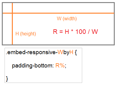
Bạn có thể tạo ra một lớp .embed-responsive-*by* tùy biến, chẳng hạn .embed-responsive-5by4.
.embed-responsive-5by4
.embed-responsive-5by4 {
  padding-bottom: 80.0%;
}
Công thức tổng quát là:
210:297 là tỷ lệ giữa chiều rộng và chiều cao của tờ giấy A4. Và bạn có thể định nghĩa lớp .embed-responsive-210by297 như sau:
.embed-responsive-210by297
.embed-responsive-210by297 {
  padding-bottom: 141.42%;
}
object-pdf-responsive-example
<style>
   .embed-responsive-210by297 {
   padding-bottom: 141.42%;
   }
</style>

<div class="embed-responsive embed-responsive-210by297">
<object class="embed-responsive-item" data="example.pdf"
   type="application/pdf" internalinstanceid="9" title="">
   <p>
      Your browser isn't supporting embedded pdf files. You can download the file
      <a href="example.pdf">here</a>.
   </p>
</object>
</div
Các hướng dẫn Bootstrap
- Hướng dẫn và ví dụ Bootstrap Jumbotron
- Hướng dẫn và ví dụ Bootstrap Dropdown
- Hướng dẫn và ví dụ Bootstrap Alert
- Hướng dẫn và ví dụ Bootstrap Button
- Hướng dẫn và ví dụ Bootstrap Button Group
- Hướng dẫn và ví dụ Bootstrap Popover (Tooltip)
- Hướng dẫn và ví dụ Bootstrap Spinner
- Giới thiệu về Bootstrap
- Hướng dẫn sử dụng hệ thống lưới trong Bootstrap
- Hướng dẫn và ví dụ Bootstrap Card
- Hướng dẫn và ví dụ Bootstrap Container
- Hướng dẫn và ví dụ Bootstrap Nav, Tab, Pill
- Hướng dẫn và ví dụ Bootstrap NavBar
- Hướng dẫn và ví dụ Bootstrap Table
- Hướng dẫn và ví dụ Bootstrap Modal
- Hướng dẫn và ví dụ Bootstrap Form
- Hướng dẫn và ví dụ Bootstrap Pagination
- Hướng dẫn và ví dụ Bootstrap Badge
- Hướng dẫn và ví dụ Bootstrap Input Group
- Hướng dẫn và ví dụ Bootstrap List Group
- Hướng dẫn và ví dụ Bootstrap ProgressBar
- Hướng dẫn và ví dụ Bootstrap Collapse và Accordion
- Hướng dẫn và ví dụ Bootstrap Scrollspy
- Hướng dẫn và ví dụ Bootstrap Breadcrumb
- Hướng dẫn và ví dụ Bootstrap Carousel
- Hướng dẫn và ví dụ tiện ích Bootstrap Spacing
- Hướng dẫn và ví dụ tiện ích Bootstrap Border
- Hướng dẫn và ví dụ tiện ích Bootstrap Color
- Hướng dẫn và ví dụ tiện ích Bootstrap Text
- Hướng dẫn và ví dụ tiện ích Bootstrap Sizing
- Hướng dẫn và ví dụ tiện ích Bootstrap Position
- Hướng dẫn và ví dụ tiện ích Bootstrap Flex
- Hướng dẫn và ví dụ tiện ích Bootstrap Display
- Hướng dẫn và ví dụ tiện ích Bootstrap Visibility
- Hướng dẫn và ví dụ tiện ích Bootstrap Embed
Show More