Hướng dẫn và ví dụ tiện ích Bootstrap Position
1. Tổng quan về Bootstrap Position
Bootstrap xây dựng sẵn một vài lớp tiện ích để thiết lập vị trí (Position) cho phần tử:
- .position-static
- .position-relative
- .position-absolute
- .position-fixed
- .position-sticky
Thay vì sử dụng các lớp ở trên bạn có thể sử dụng Css property dưới đây để có cùng một kết quả:
- style="position:static"
- style="position:relative"
- style="position:absolute"
- style="position:fixed"
- style="position:sticky"
Ngoài ra, một vài lớp khác cũng rất hữu ích, mà bạn dễ dàng hiểu được mục đích của nó:
- .fixed-top
- .fixed-bottom
- .sticky-top
2. Class .position-static
Các phần tử trong HTML được định vị tĩnh (Positioned static) theo mặc định, điều đó có nghĩa là vị trí của nó được xác định theo quy tắc thông thường của trang. Nó không bị ảnh hưởng bởi các Css property: left, right, top, bottom nếu bạn cố tình thiết lập cho nó.
Chú ý: Thay vì sử dụng lớp .position-static của Bootstrap, bạn có thể sử dụng Css property (position: static) để được kết quả tương tự.
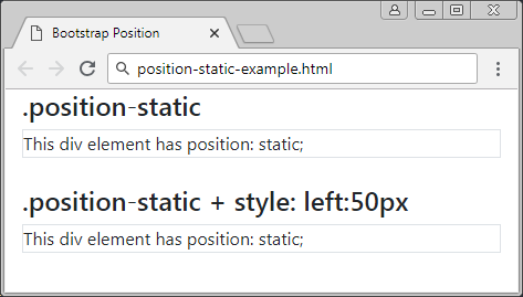
positon-static-example
<div class= "container-fluid">
   <h4>.position-static</h4>
   <div class="position-static border">
      This div element has position: static;
   </div>
   <br>
   <h4>.position-static + style: left:50px</h4>
   <div class="position-static border" style="left:50px">
      This div element has position: static;
   </div>
</div>
3. Class .position-relative
Một phần tử được áp dụng lớp .position-relative cũng giống như nó được áp dụng Css property (postion: relative). Điều đó có nghĩa là nó sẽ được định vị tương đối (positioned relative) so với vị trí thông thường của nó. Hay nói cách khác bạn có thể sử dụng Css property (left, right, top, bottom) để điều chỉnh (dịch chuyển) vị trí bên trái, bên phải, bên trên, bên dưới so với vị trí thông thường của nó.
position-relative-example.html
<div class= "container-fluid">
   <h4>.position-relative</h4>
   <div class="position-relative border" style="width:450px;">
      .position-relative (width:450px)
   </div>
   <br>
   <h4>.position-relative + style (left:50px; top:50px;)</h4>
   <div class="position-relative border" style="left:50px; top:50px; width:450px;">
      .position-relative (width:450px; left:50px; top:50px;)
   </div>
</div>
4. Class .position-fixed
Một phần tử được áp dụng lớp .position-fixed cũng giống như nó được áp dụng Css property (position: fixed). Điều đó có nghĩa là nó sẽ được định vị tương đối (positioned relative) so với khung nhìn (viewport) của trình duyệt.
Vi dụ dưới đây, một phần tử được cố định với bên dưới (bottom) và bên phải (right) của khung nhìn (viewport):
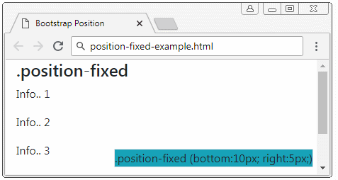
position-fixed-example
<div class= "container-fluid">
   <h4>.position-fixed</h4>
   <div class="position-fixed border bg-info" style="bottom:10px; right:5px;">
      .position-fixed (bottom:10px; right:5px;)
   </div>
   <p>Info.. 1</p>
   <p>Info.. 2</p>
   <p>Info.. 3</p>
   <p>Info.. 4</p>
   <p>Info.. 5</p>
</div>
Một đặc điểm đặc biệt của phần tử với {position: fixed} là bạn có thể neo (anchor) cố định 4 cạnh của nó với 4 cạnh của khung nhìn (viewport) của trình duyệt. Trong trường hợp đó, nếu kích thước của viewport thay đổi, kích thước của phần tử này cũng thay đổi theo. Nó giống như hình minh họa dưới đây:
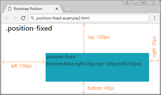
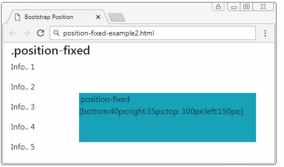
position-fixed-example2
<div class= "container-fluid">
   <h4>.position-fixed</h4>

   <div class="position-fixed border bg-info"
      style="bottom:40px;right:35px;top: 100px;left:150px;">
      .position-fixed <br>

      (bottom:40px;right:35px;top: 100px;left:150px;)
   </div>

   <p>Info.. 1</p>
   <p>Info.. 2</p>
   <p>Info.. 3</p>
   <p>Info.. 4</p>
   <p>Info.. 5</p>
</div>
5. Class .position-absolute
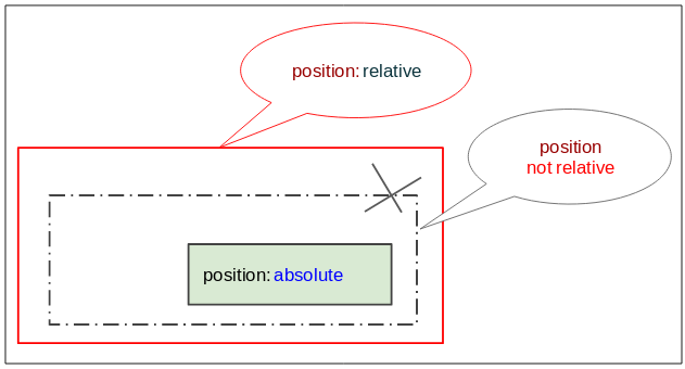
Phần tử được áp dụng lớp .position-absolute (Vị trí tuyệt đối) sẽ tìm kiếm phần tử tổ tiên (cha, ông,..) gần nhất của nó mà phần tử này có {position: relative}. Sau khi tìm thấy nó sẽ thiết lập vị trí tương đối so với phần tử này. Nếu không tìm thấy nó sẽ thiết lập vị trí tương đối so với khung nhìn (Viewport) của trình duyệt.
position-absolute-example
<div class= "container-fluid">
   <h4 class="mb-3">.position-absolute example</h4>

   <div class="position-relative border border-danger" style="height:200px;">
      .position-relative

      <div class="position-absolute border bg-info" style="bottom:10px; right:15px;">
         .position-absolute (bottom:10px; right:15px;)
      </div>

   </div>

</div>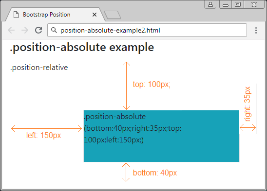
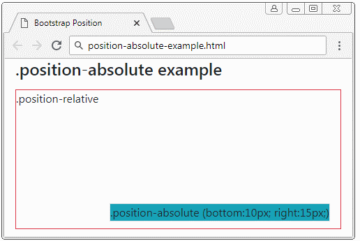
position-absolute-example2
<div class= "container-fluid">
   <h4 class="mb-3">.position-absolute example</h4>

   <div class="position-relative border border-danger" style="height:250px;">
      .position-relative
      <div class="position-absolute border bg-info"
         style="bottom:40px;right:35px;top: 100px;left:150px;">
         .position-absolute (bottom:40px;right:35px;top: 100px;left:150px;)
      </div>
   </div>

</div>
6. Class .position-sticky
Một phần tử được áp dụng lớp .position-sticky cũng giống như nó được áp dụng Css property (position: sticky). Vị trí của nó dựa trên vị trí cuộn (scoll position) của người dùng.
Phần tử Sticky sẽ chuyển đổi từ "relative" sang "fixed" hoặc ngược lại phụ thuộc vào vị trí cuộn của người dùng.
Chú ý: Trình duyệt IE/Edge phiên bản 15 hoặc cũ hơn không hỗ trợ {position: sticky}.
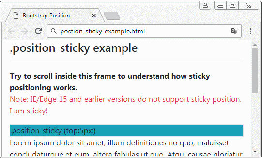
position-sticky-example.html
<!DOCTYPE html>
<html>
   <head>
      <meta charset="utf-8">
      <title>Bootstrap Position</title>
      <link rel="stylesheet" href="https://stackpath.bootstrapcdn.com/bootstrap/4.1.1/css/bootstrap.min.css">
   </head>
   <body>
      <div class= "container-fluid">
         <h4 class="mb-3">.position-sticky example</h4>
         <hr>
         <b>Try to scroll inside this frame to understand how sticky positioning works.</b>
         <p class="text-danger">
            Note: IE/Edge 15 and earlier versions do not support sticky position.
            I am sticky!
         </p>
         <div class="position-sticky border bg-info" style="top:5px;">
            .position-sticky (top:5px;)
         </div>

         <p>
            Lorem ipsum dolor sit amet, illum definitiones no quo, maluisset concludaturque et eum,
            altera fabulas ut quo. Atqui causae gloriatur ius te, id agam omnis evertitur eum.
            Affert laboramus repudiandae nec et. Inciderint efficiantur his ad. Eum no molestiae voluptatibus.
         </p>
      </div>
      <script src="https://code.jquery.com/jquery-3.3.1.slim.min.js"></script>
      <script src="https://cdnjs.cloudflare.com/ajax/libs/popper.js/1.14.3/umd/popper.min.js"></script>
      <script src="https://stackpath.bootstrapcdn.com/bootstrap/4.1.1/js/bootstrap.min.js"></script>
   </body>
</html>
7. Class .fixed-top, fixed-bottom, .sticky-top
Lớp .fixed-top được áp dụng cho phần tử để cố định nó vào phía trên khung nhìn (viewport) của trình duyệt. (Xem thêm giải thích tại mục .position-fixed)
.fixed-top (Bootstrap code)
.fixed-top {
    position: fixed;
    top: 0;
    right: 0;
    left: 0;
    z-index: 1030;
}
Lớp .fixed-bottom được áp dụng cho phần tử để cố định nó vào phía dưới khung nhìn (viewport) của trình duyệt. (Xem thêm giải thích tại mục .position-fixed)
.fixed-bottom (Bootstrap Code)
.fixed-bottom {
    position: fixed;
    right: 0;
    bottom: 0;
    left: 0;
    z-index: 1030;
}
.sticky-top
Lớp .sticky-top khá giống với .position-sticky, bạn có thể xem thêm giải thích tại mục .position-sticky.
.sticky-top (Bootstrap Code)
.sticky-top {
    position: -webkit-sticky; /* Safari Browser */
    position: sticky;
    top: 0;
    z-index: 1020;
}
Các hướng dẫn Bootstrap
- Hướng dẫn và ví dụ Bootstrap Jumbotron
- Hướng dẫn và ví dụ Bootstrap Dropdown
- Hướng dẫn và ví dụ Bootstrap Alert
- Hướng dẫn và ví dụ Bootstrap Button
- Hướng dẫn và ví dụ Bootstrap Button Group
- Hướng dẫn và ví dụ Bootstrap Popover (Tooltip)
- Hướng dẫn và ví dụ Bootstrap Spinner
- Giới thiệu về Bootstrap
- Hướng dẫn sử dụng hệ thống lưới trong Bootstrap
- Hướng dẫn và ví dụ Bootstrap Card
- Hướng dẫn và ví dụ Bootstrap Container
- Hướng dẫn và ví dụ Bootstrap Nav, Tab, Pill
- Hướng dẫn và ví dụ Bootstrap NavBar
- Hướng dẫn và ví dụ Bootstrap Table
- Hướng dẫn và ví dụ Bootstrap Modal
- Hướng dẫn và ví dụ Bootstrap Form
- Hướng dẫn và ví dụ Bootstrap Pagination
- Hướng dẫn và ví dụ Bootstrap Badge
- Hướng dẫn và ví dụ Bootstrap Input Group
- Hướng dẫn và ví dụ Bootstrap List Group
- Hướng dẫn và ví dụ Bootstrap ProgressBar
- Hướng dẫn và ví dụ Bootstrap Collapse và Accordion
- Hướng dẫn và ví dụ Bootstrap Scrollspy
- Hướng dẫn và ví dụ Bootstrap Breadcrumb
- Hướng dẫn và ví dụ Bootstrap Carousel
- Hướng dẫn và ví dụ tiện ích Bootstrap Spacing
- Hướng dẫn và ví dụ tiện ích Bootstrap Border
- Hướng dẫn và ví dụ tiện ích Bootstrap Color
- Hướng dẫn và ví dụ tiện ích Bootstrap Text
- Hướng dẫn và ví dụ tiện ích Bootstrap Sizing
- Hướng dẫn và ví dụ tiện ích Bootstrap Position
- Hướng dẫn và ví dụ tiện ích Bootstrap Flex
- Hướng dẫn và ví dụ tiện ích Bootstrap Display
- Hướng dẫn và ví dụ tiện ích Bootstrap Visibility
- Hướng dẫn và ví dụ tiện ích Bootstrap Embed
Show More