Hướng dẫn và ví dụ Flutter IconButton
1. Flutter IconButton
Trong Flutter, IconButton là một button với một biểu tượng (Icon), người dùng có thể click vào nó để thực hiện một hành động. IconButton sẽ không bao gồm nội dung văn bản, nếu bạn muốn có một button bao gồm biểu tượng và văn bản hãy sử dụng FlatButton hoặc RaisedButton.
IconButton Constructor:
IconButton Contructor
const IconButton (
    {Key key,
    double iconSize: 24.0,
    VisualDensity visualDensity,
    EdgeInsetsGeometry padding: const EdgeInsets.all(8.0),
    AlignmentGeometry alignment: Alignment.center,
    double splashRadius,
    @required Widget icon,
    Color color,
    Color focusColor,
    Color hoverColor,
    Color highlightColor,
    Color splashColor,
    Color disabledColor,
    @required VoidCallback onPressed,
    MouseCursor mouseCursor: SystemMouseCursors.click,
    FocusNode focusNode,
    bool autofocus: false,
    String tooltip,
    bool enableFeedback: true,
    BoxConstraints constraints}
)
IconButton thường được sử dụng như một action trong property AppBar.actions, nó cũng được sử dụng trong nhiều tình huống khác.
Vùng tương tác (hit region) của IconButton là vùng có thể cảm nhận được sự tương tác của người dùng, nó có kích thước nhỏ nhất là kMinInteractiveDimension (48.0) bất kể kích thước thực sự của Icon là thế nào.

2. icon
Property icon được sử dụng để chỉ định một biểu tượng (icon) cho IconButton.
@required Widget icon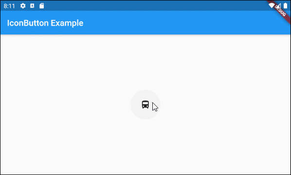
main.dart (icon ex1)
import 'package:flutter/material.dart';

void main() {
  runApp(MyApp());
}

class MyApp extends StatelessWidget {
  // This widget is the root of your application.
  @override
  Widget build(BuildContext context) {
    return MaterialApp(
      title: 'Title of Application',
      theme: ThemeData(
        primarySwatch: Colors.blue,
        visualDensity: VisualDensity.adaptivePlatformDensity,
      ),
      home: MyHomePage(),
    );
  }
}

class MyHomePage extends StatelessWidget {
  MyHomePage({Key key}) : super(key: key);

  @override
  Widget build(BuildContext context) {
    return Scaffold(
      appBar: AppBar(
        title: Text("IconButton Example"),
      ),
      body: Center(
          child:  IconButton (
              icon: Icon(Icons.directions_bus),
              onPressed: () {
                print("Pressed");
              }
          )
      ),
    );
  }
}
Bạn có thể gán một đối tượng Widget bất kỳ cho property IconButton.icon, nhưng nó nên chứa một biểu tượng (icon) hoặc hình ảnh (image), các trường hợp khác là không phù hợp với mục tiêu thiết kế của IconButton.

ImageButton - icon (ex2)
IconButton (
    icon: Image.network("https://raw.githubusercontent.com/o7planning/rs/master/flutter/feel_good_24.png"),
    onPressed: () {
      print("Pressed");
    }
)
Hãy xem điều gì xẩy ra nếu IconButton.icon là một đối tượng Text?

ImageButton - icon (ex3)
IconButton (
    icon: Text("???????????"),
    onPressed: () {
      print("Pressed");
    }
)- Hướng dẫn và ví dụ Flutter Icon
3. iconSize
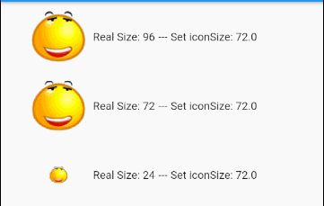
Property iconSize được sử dụng để chỉ định kích thước của biểu tượng (icon), giá trị mặc định của nó là 24. Nếu kích thước thực sự của icon lớn hơn iconSize nó sẽ bị co lại bằng iconSize khi hiển thị, ngược lại kích thước hiển thị của icon sẽ không thay đổi.
double iconSize: 24.0Ví dụ:
IconButton (
  icon: Image.network("https://raw.githubusercontent.com/o7planning/rs/master/flutter/feel_good_24.png"),
  onPressed: () {
    print("Pressed");
  },
  iconSize: 96
)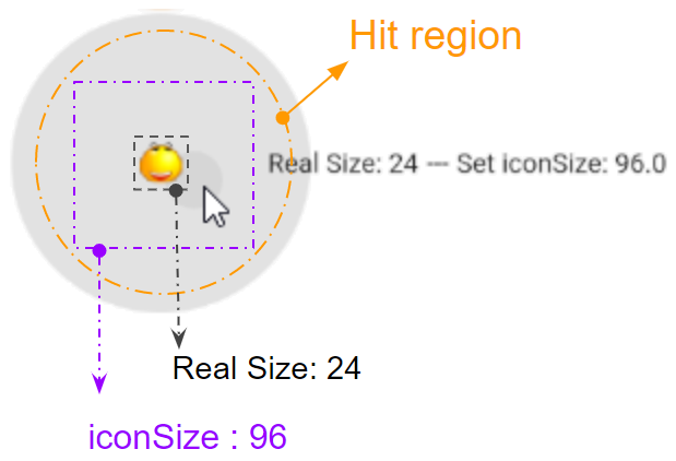
Vùng tương tác (Hit region) của IconButton là vùng cảm nhận được sự tương tác của người dùng, chẳng hạn click. Giá trị của iconSize càng lớn thì vùng tương tác cũng càng lớn, bất kể kích thước thực sự của icon là như thế nào. Tuy nhiên vùng tương tác sẽ có kích thước nhỏ nhất là kMinInteractiveDimension (48.0) để đảm bảo rằng nó không quá bé đối với người dùng để có thể tương tác.
Nếu kích thước thực sự của icon lớn hơn iconSize thì nó sẽ bị co lại bằng với iconSize khi hiển thị.
main.dart (iconSize ex1)
import 'package:flutter/material.dart';
void main() {
runApp(MyApp());
}
class MyApp extends StatelessWidget {
// This widget is the root of your application.
@override
Widget build(BuildContext context) {
return MaterialApp(
title: 'Title of Application',
theme: ThemeData(
primarySwatch: Colors.blue,
visualDensity: VisualDensity.adaptivePlatformDensity,
),
home: MyHomePage(),
);
}
}
class MyHomePage extends StatelessWidget {
MyHomePage({Key key}) : super(key: key);
@override
Widget build(BuildContext context) {
return Scaffold (
appBar: AppBar(
title: Text("IconButton Example"),
),
body: Center(
child: getIconButtons()
),
);
}
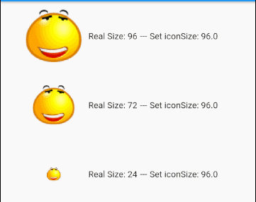
Widget getIconButtons() {
double MAX_SIZE = 96;
double LEFT = 30;
return Center(
child: Column (
children: [
Row (
children: [
SizedBox(width: LEFT),
IconButton (
icon: Image.network("https://raw.githubusercontent.com/o7planning/rs/master/flutter/feel_good_96.png"),
onPressed: () {
print("Pressed");
},
iconSize: MAX_SIZE,
),
Text("Real Size: 96"),
Text(" --- "),
Text("Set iconSize: " + MAX_SIZE.toString()),
]
),
Row (
children: [
SizedBox(width: LEFT),
IconButton (
icon: Image.network("https://raw.githubusercontent.com/o7planning/rs/master/flutter/feel_good_72.png"),
onPressed: () {
print("Pressed");
},
iconSize: MAX_SIZE,
),
Text("Real Size: 72"),
Text(" --- "),
Text("Set iconSize: " + MAX_SIZE.toString()),
]
),
Row (
children: [
SizedBox(width: LEFT),
IconButton (
icon: Image.network("https://raw.githubusercontent.com/o7planning/rs/master/flutter/feel_good_24.png"),
onPressed: () {
print("Pressed");
},
iconSize: MAX_SIZE,
),
Text("Real Size: 24"),
Text(" --- "),
Text("Set iconSize: " + MAX_SIZE.toString()),
]
),
])
);
}
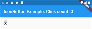
}4. onPressed
onPressed là một hàm callback sẽ được gọi khi người dùng nhấn xuống IconButton. Nếu onPressed không được chỉ định IconButton sẽ bị vô hiệu hóa (disabled), không có phản ứng gì khi người dùng nhấp vào nó.
@required VoidCallback onPressed;IconButton (
icon: Icon(Icons.directions_bus),
onPressed: () {
print("Pressed");
}
)
// Or:
Function onPressedHandler = () {
print("Pressed");
};
....
IconButton (
icon: Icon(Icons.directions_bus),
onPressed: onPressedHandler
)Ví dụ:
main.dart (onPressed ex2)
import 'package:flutter/material.dart';

void main() {
  runApp(MyApp());
}

class MyApp extends StatelessWidget {
  // This widget is the root of your application.
  @override
  Widget build(BuildContext context) {
    return MaterialApp(
      title: 'Title of Application',
      theme: ThemeData(
        primarySwatch: Colors.blue,
        visualDensity: VisualDensity.adaptivePlatformDensity,
      ),
      home: MyHomePage(),
    );
  }
}

class MyHomePage extends StatefulWidget {
  MyHomePage({Key key}) : super(key: key);

  @override
  State<StatefulWidget> createState() {
    return MyHomePageState();
  }
}

class MyHomePageState extends State<MyHomePage> {
  int clickCount = 0;

  @override
  Widget build(BuildContext context) {
    return Scaffold (

        appBar: AppBar(
          title: Text("IconButton Example. Click count: " + this.clickCount.toString()),
        ),
        body: IconButton (
            icon: Icon(Icons.directions_bus),
            onPressed: ()  {
              setState(() {
                this.clickCount++;
              });
            }
        )
    );
  }
}
5. color
Property color chỉ định mầu sắc cho icon bên trong IconButton khi IconButton này đang trong trạng thái thông thường (Enabled).
Color color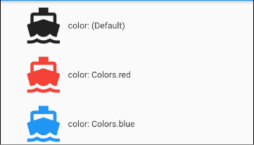
color (ex1)
IconButton (
  icon: Icon(Icons.directions_boat),
  onPressed: () {
    print("Pressed");
  },
  iconSize: MAX_SIZE,
  color: Colors.blue,
),
6. disabledColor
Property disabledColor chỉ định mầu sắc cho icon bên trong IconButton khi IconButton này đang trong trạng thái bị vô hiệu hóa (disabled). Một IconButton sẽ ở trong trạng thái bị vô hiệu hóa nếu onPressed là null hoặc không được chỉ định.
Color disabledColor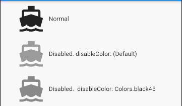
disabledColor (ex1)
IconButton (
  icon: Icon(Icons.directions_boat),
  iconSize: 64
  disabledColor: Colors.black45,
),
7. splashRadius
Property splashRadius chỉ định bán kính của chớp sáng bao quanh IconButton khi người dùng nhấn xuống IconButton. Giá trị mặc định của nó là defaultSplashRadius (35).
double splashRadius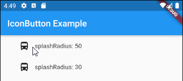
splashRadius (ex1)
IconButton (
  icon: Icon(Icons.directions_bus),
  onPressed: () {
    print("Pressed");
  },
  splashRadius: 50,
)
8. splashColor
Property splashColor chỉ định mầu sắc chính (primary color) của chớp sáng bao quanh vị trí mà người dùng nhấn xuống (press down) IconButton.
Color splashColor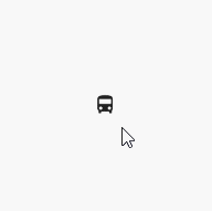
splashColor (ex1)
IconButton (
    icon: Icon(Icons.directions_bus),
    onPressed: () {
      print("Pressed");
    },
    splashRadius: 100,
    splashColor: Colors.lightGreenAccent
)
9. highlightColor
Property splashColor chỉ định mầu sắc phụ (secondary color) của chớp sáng bao quanh vị trí mà người dùng nhấn xuống (press down) IconButton.
Color highlightColor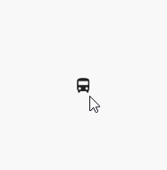
highlightColor (ex1)
IconButton (
  icon: Icon(Icons.directions_bus),
  onPressed: () {
    print("Pressed");
  },
  splashRadius: 100,
  splashColor: Colors.blue,
  highlightColor: Colors.red,
),12. tooltip
Property tooltip là một văn bản mô tả về IconButton, nó sẽ xuất hiện khi người dùng nhấp vào IconButton này.
String tooltip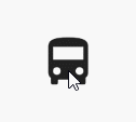
tooltip (ex1)
IconButton (
  icon: Icon(Icons.directions_bus),
  onPressed: () {
    print("Pressed");
  },
  iconSize: 64,
  tooltip: "Bus Direction",
)17. padding
Property padding được sử dụng để thiết lập khoảng không gian nằm trong viền và bao quanh nội dung của button.
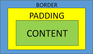
EdgeInsetsGeometry padding: const EdgeInsets.all(8.0)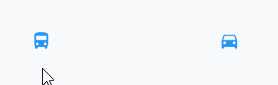
padding (ex1)
IconButton (
    icon: Icon(Icons.directions_bus),
    onPressed: () {},
    color: Colors.blue,
    padding: EdgeInsets.all(10)
)

IconButton (
    icon: Icon(Icons.directions_car),
    onPressed: () {},
    color: Colors.blue,
    padding: EdgeInsets.fromLTRB(50, 10, 30, 10)
)Các hướng dẫn lập trình Flutter
- Hướng dẫn và ví dụ Flutter Column
- Hướng dẫn và ví dụ Flutter Stack
- Hướng dẫn và ví dụ Flutter IndexedStack
- Hướng dẫn và ví dụ Flutter Spacer
- Hướng dẫn và ví dụ Flutter Expanded
- Hướng dẫn và ví dụ Flutter SizedBox
- Hướng dẫn và ví dụ Flutter Tween
- Cài đặt Flutter SDK trên Windows
- Cài đặt Flutter Plugin cho Android Studio
- Tạo ứng dụng Flutter đầu tiên của bạn - Hello Flutter
- Hướng dẫn và ví dụ Flutter Scaffold
- Hướng dẫn và ví dụ Flutter AppBar
- Hướng dẫn và ví dụ Flutter BottomAppBar
- Hướng dẫn và ví dụ Flutter SliverAppBar
- Hướng dẫn và ví dụ Flutter TextButton
- Hướng dẫn và ví dụ Flutter ElevatedButton
- Hướng dẫn và ví dụ Flutter ShapeBorder
- Hướng dẫn và ví dụ Flutter EdgeInsetsGeometry
- Hướng dẫn và ví dụ Flutter EdgeInsets
- Hướng dẫn và ví dụ Flutter CircularProgressIndicator
- Hướng dẫn và ví dụ Flutter LinearProgressIndicator
- Hướng dẫn và ví dụ Flutter Center
- Hướng dẫn và ví dụ Flutter Align
- Hướng dẫn và ví dụ Flutter Row
- Hướng dẫn và ví dụ Flutter SplashScreen
- Hướng dẫn và ví dụ Flutter Alignment
- Hướng dẫn và ví dụ Flutter Positioned
- Hướng dẫn và ví dụ Flutter ListTile
- Hướng dẫn và ví dụ Flutter SimpleDialog
- Hướng dẫn và ví dụ Flutter AlertDialog
- Navigation và Routing trong Flutter
- Hướng dẫn và ví dụ Flutter Navigator
- Hướng dẫn và ví dụ Flutter TabBar
- Hướng dẫn và ví dụ Flutter Banner
- Hướng dẫn và ví dụ Flutter BottomNavigationBar
- Hướng dẫn và ví dụ Flutter FancyBottomNavigation
- Hướng dẫn và ví dụ Flutter Card
- Hướng dẫn và ví dụ Flutter Border
- Hướng dẫn và ví dụ Flutter ContinuousRectangleBorder
- Hướng dẫn và ví dụ Flutter RoundedRectangleBorder
- Hướng dẫn và ví dụ Flutter CircleBorder
- Hướng dẫn và ví dụ Flutter StadiumBorder
- Hướng dẫn và ví dụ Flutter Container
- Hướng dẫn và ví dụ Flutter RotatedBox
- Hướng dẫn và ví dụ Flutter CircleAvatar
- Hướng dẫn và ví dụ Flutter TextField
- Hướng dẫn và ví dụ Flutter IconButton
- Hướng dẫn và ví dụ Flutter FlatButton
- Hướng dẫn và ví dụ Flutter SnackBar
- Hướng dẫn và ví dụ Flutter Drawer
- Ví dụ Flutter Navigator pushNamedAndRemoveUntil
- Hiển thị hình ảnh trên Internet trong Flutter
- Hiển thị ảnh Asset trong Flutter
- Flutter TextInputType các kiểu bàn phím
- Hướng dẫn và ví dụ Flutter NumberTextInputFormatter
- Hướng dẫn và ví dụ Flutter Builder
- Làm sao xác định chiều rộng của Widget cha trong Flutter
- Bài thực hành Flutter thiết kế giao diện màn hình đăng nhập
- Bài thực hành Flutter thiết kế giao diện trang (1)
- Khuôn mẫu thiết kế Flutter với các lớp trừu tượng
- Bài thực hành Flutter thiết kế trang Profile với Stack
- Bài thực hành Flutter thiết kế trang profile (2)
- Hướng dẫn và ví dụ Flutter ListView
- Hướng dẫn và ví dụ Flutter GridView
- Bài thực hành Flutter với gói http và dart:convert (2)
- Bài thực hành Flutter với gói http và dart:convert (1)
- Ứng dụng Flutter Responsive với Menu Drawer
- Flutter GridView với SliverGridDelegate tuỳ biến
- Hướng dẫn và ví dụ Flutter image_picker
- Flutter upload ảnh sử dụng http và ImagePicker
- Hướng dẫn và ví dụ Flutter SharedPreferences
- Chỉ định cổng cố định cho Flutter Web trên Android Studio
- Tạo Module trong Flutter
- Hướng dẫn và ví dụ Flutter SkeletonLoader
- Hướng dẫn và ví dụ Flutter Slider
- Hướng dẫn và ví dụ Flutter Radio
- Bài thực hành Flutter SharedPreferences
- Hướng dẫn và ví dụ Flutter InkWell
- Hướng dẫn và ví dụ Flutter GetX GetBuilder
- Hướng dẫn và ví dụ Flutter GetX obs Obx
- Hướng dẫn và ví dụ Flutter flutter_form_builder
- Xử lý lỗi 404 trong Flutter GetX
- Flutter BloC cho người mới bắt đầu
- Ví dụ đăng nhập và đăng xuất với Flutter Getx
- Hướng dẫn và ví dụ Flutter multi_dropdown
Show More