Hướng dẫn và ví dụ Flutter CircularProgressIndicator
1. CircularProgressIndicator
CircularProgressIndicator là một lớp con của ProgressIndicator, nó tạo ra một chỉ báo tiến trình (progress indicator) dạng hình tròn.
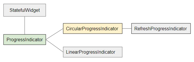
- LinearProgressIndicator
- ProgressIndicator
CircularProgressIndicator được chia làm 2 loại:
Determinate
Determinate (Xác định): Là một chỉ báo tiến trình có thể hiển thị cho người dùng phần trăm công việc mà nó đã hoàn thành dựa trên giá trị của property value (Giá trị nằm trong khoảng 0 tới 1)
Indeterminate
Indeterminate (Không xác định): Là một chỉ báo tiến trình không xác định được phần trăm công việc đã hoàn thành và không thể xác định được thời điểm kết thúc.
CircularProgressIndicator Constructor:
CircularProgressIndicator constructor
const CircularProgressIndicator(
{Key key,
double value,
Color backgroundColor,
Animation<Color> valueColor,
double strokeWidth: 4.0,
String semanticsLabel,
String semanticsValue}
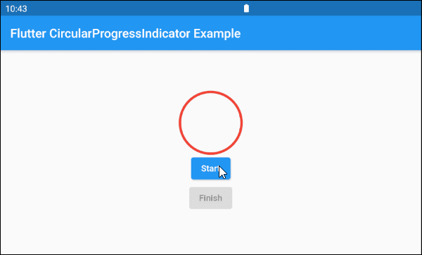
)2. Example: Indeterminate
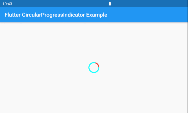
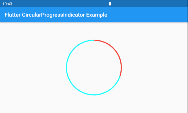
Chúng ta sẽ bắt đầu với một ví dụ đơn giản nhất, một CircularProgressIndicator mô phỏng một tiến trình đang hoạt động nhưng không biết rõ phần trăm công việc đã được hoàn thành và không biết thời điểm kết thúc.
main.dart (ex 1)
import 'package:flutter/material.dart';
void main() => runApp(MyApp());
class MyApp extends StatelessWidget {
@override
Widget build(BuildContext context) {
return MaterialApp(
title: 'o7planning.org',
debugShowCheckedModeBanner: false,
home: HomePage(),
);
}
}
class HomePage extends StatelessWidget {
@override
Widget build(BuildContext context) {
return Scaffold(
appBar: AppBar(
title: Text('Flutter CircularProgressIndicator Example'),
),
body: Center(
child: CircularProgressIndicator(
backgroundColor: Colors.cyanAccent,
valueColor: new AlwaysStoppedAnimation<Color>(Colors.red),
),
),
);
}
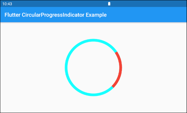
}Theo mặc định CircularProgressIndicator có bán kính khá nhỏ, nếu bạn muốn tuỳ biến kích thước hãy đặt nó trong một SizedBox.
SizedBox(
  width: 200,
  height: 200,
  child: CircularProgressIndicator(
    strokeWidth: 10,
    backgroundColor: Colors.cyanAccent,
    valueColor: new AlwaysStoppedAnimation<Color>(Colors.red),
  ),
)Tham số valueColor được sử dụng để chỉ định một hiệu ứng hoạt hình mầu sắc cho tiến trình (progress) của CircularProgressIndicator, chẳng hạn:
valueColor: new AlwaysStoppedAnimation<Color>(Colors.red)AlwaysStoppedAnimation<Color> sẽ luôn luôn ngừng hiệu ứng hoạt hình đối với CircularProgressIndicator nếu tham số value là một giá trị cụ thể khác null.
SizedBox(
  width: 200,
  height: 200,
  child: CircularProgressIndicator(
    value: 0.3,
    backgroundColor: Colors.cyanAccent,
    valueColor: new AlwaysStoppedAnimation<Color>(Colors.red),
  ),
)
Dựa trên các quy tắc đặc điểm nói trên của tham số value và valueColor bạn có thể điều khiển hành vi của CircularProgressIndicator, hãy xem một ví dụ:
main.dart (ex 1d)
import 'package:flutter/material.dart';

void main() => runApp(MyApp());

class MyApp extends StatelessWidget {
  @override
  Widget build(BuildContext context) {
    return MaterialApp(
      title: 'o7planning.org',
      debugShowCheckedModeBanner: false,
      home: HomePage(),
    );
  }
}

class HomePage extends StatefulWidget {

  @override
  State<StatefulWidget> createState() {
    return _HomePageState();
  }
}

class _HomePageState extends State<HomePage> {

  bool _working = false;

  void startWorking() async {
    this.setState(() {
      this._working = true;
    });
  }

  void finishWorking() {
    this.setState(() {
      this._working = false;
    });
  }

  @override
  Widget build(BuildContext context) {
    return Scaffold(
      appBar: AppBar(
        title: Text('Flutter CircularProgressIndicator Example'),
      ),
      body: Center(
          child:  Column (
              mainAxisAlignment: MainAxisAlignment.center,
              children:  [
                SizedBox(
                  width: 100,
                  height: 100,
                  child: CircularProgressIndicator(
                    value: this._working? null: 1,
                    backgroundColor: Colors.cyanAccent,
                    valueColor: new AlwaysStoppedAnimation<Color>(Colors.red),
                  ),
                ),
                ElevatedButton(
                    child: Text("Start"),
                    onPressed: this._working? null: () {
                      this.startWorking();
                    }
                ),
                ElevatedButton(
                    child: Text("Finish"),
                    onPressed: !this._working? null: () {
                      this.finishWorking();
                    }
                )
              ]
          )
      ),
    );
  }
}
3. Example: Determinate
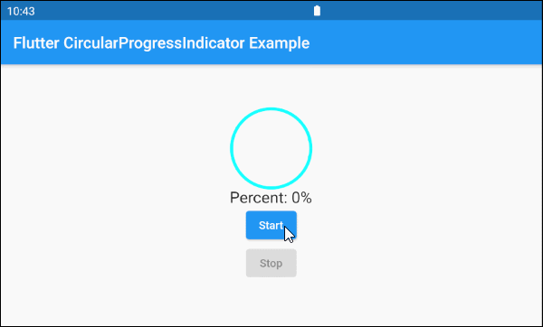
Tiếp theo là một ví dụ sử dụng CircularProgressIndicator để biểu thị một tiến trình với thông tin về phần trăm công việc đã hoàn thành. Tham số value có giá trị từ 0 đến 1.
main.dart (ex 2)
import 'package:flutter/material.dart';

void main() => runApp(MyApp());

class MyApp extends StatelessWidget {
  @override
  Widget build(BuildContext context) {
    return MaterialApp(
      title: 'o7planning.org',
      debugShowCheckedModeBanner: false,
      home: HomePage(),
    );
  }
}

class HomePage extends StatefulWidget {

  @override
  State<StatefulWidget> createState() {
    return _HomePageState();
  }
}

class _HomePageState extends State<HomePage> {

  double _value = 0;
  bool _working = false;

  void startWorking()  async {
    this.setState(() {
      this._working = true;
      this._value = 0;
    });
    for(int i = 0; i< 10; i++) {
      if(!this._working)  {
         break;
      }
      await Future.delayed(Duration(seconds: 1));
      this.setState(() {
        this._value += 0.1;
      });
    }
    this.setState(() {
      this._working = false;
    });
  }

  void stopWorking() {
    this.setState(() {
      this._working = false;
    });
  }

  @override
  Widget build(BuildContext context) {
    return Scaffold(
      appBar: AppBar(
        title: Text('Flutter CircularProgressIndicator Example'),
      ),
      body: Center(
          child:  Column (
              mainAxisAlignment: MainAxisAlignment.center,
              children:  [
                SizedBox(
                  width: 100,
                  height: 100,
                  child: CircularProgressIndicator(
                    value: this._value,
                    backgroundColor: Colors.cyanAccent,
                    valueColor: new AlwaysStoppedAnimation<Color>(Colors.red),
                  ),
                ),
                Text(
                  "Percent: " + (this._value * 100).round().toString()+ "%",
                  style: TextStyle(fontSize: 20),
                ),
                ElevatedButton(
                    child: Text("Start"),
                    onPressed: this._working? null: () {
                      this.startWorking();
                    }
                ),
                ElevatedButton(
                    child: Text("Stop"),
                    onPressed: !this._working? null: () {
                      this.stopWorking();
                    }
                )
              ]
          )
      ),
    );
  }
}
4. backgroundColor
backgroundColor được sử dụng để sét đặt mầu nền cho CircularProgressIndicator.
Color backgroundColor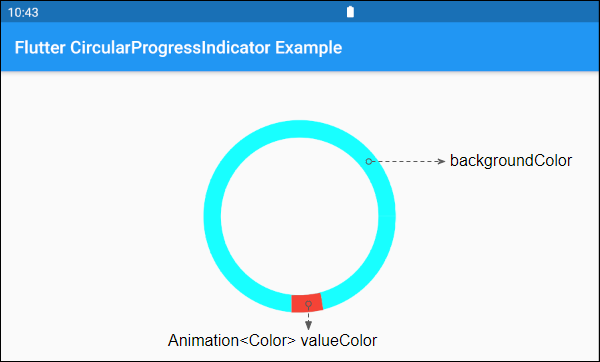
6. valueColor
valueColor được sử dụng để chỉ định một hiệu ứng hoạt hình mầu sắc cho tiến trình (progress).
Animation<Color> valueColor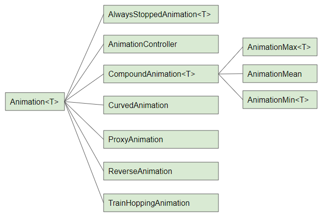
Ví dụ:
CircularProgressIndicator(
  strokeWidth: 20,
  backgroundColor: Colors.cyanAccent,
  valueColor: new AlwaysStoppedAnimation<Color>(Colors.red),
)- Hướng dẫn và ví dụ Flutter Animation
7. strokeWidth
strokeWidth là chiều rộng của nét vẽ đường tròn, giá trị mặc định là 4 pixel.
double strokeWidth: 4.08. semanticsLabel
semanticsLabel được sử dụng để mô tả mục đích sử dụng của CircularProgressIndicator, nó hoàn toàn ẩn trên giao diện và có ý nghĩa với các thiết bị đọc màn hình (Screen reader), chẳng hạn các thiết bị đọc màn hình dành cho người mù.
String semanticsLabel9. semanticsValue
semanticsValue hoàn toàn ẩn trên màn hình, mục đích của nó là cung cấp thông tin về tiến trình hiện tại cho các thiết bị đọc màn hình.
Theo mặc định giá trị của semanticsValue là phần trăm công việc đã hoàn thành, chẳng hạn giá trị của property value là 0.3 thì semanticsValue sẽ là "30%".
String semanticsValueVí dụ:
CircularProgressIndicator(
  value: this._value,
  backgroundColor: Colors.cyanAccent,
  valueColor: new AlwaysStoppedAnimation<Color>(Colors.red),
  semanticsLabel: "Downloading file abc.mp3",
  semanticsValue: "Percent " + (this._value * 100).toString() + "%",
)
Các hướng dẫn lập trình Flutter
- Hướng dẫn và ví dụ Flutter Column
- Hướng dẫn và ví dụ Flutter Stack
- Hướng dẫn và ví dụ Flutter IndexedStack
- Hướng dẫn và ví dụ Flutter Spacer
- Hướng dẫn và ví dụ Flutter Expanded
- Hướng dẫn và ví dụ Flutter SizedBox
- Hướng dẫn và ví dụ Flutter Tween
- Cài đặt Flutter SDK trên Windows
- Cài đặt Flutter Plugin cho Android Studio
- Tạo ứng dụng Flutter đầu tiên của bạn - Hello Flutter
- Hướng dẫn và ví dụ Flutter Scaffold
- Hướng dẫn và ví dụ Flutter AppBar
- Hướng dẫn và ví dụ Flutter BottomAppBar
- Hướng dẫn và ví dụ Flutter SliverAppBar
- Hướng dẫn và ví dụ Flutter TextButton
- Hướng dẫn và ví dụ Flutter ElevatedButton
- Hướng dẫn và ví dụ Flutter ShapeBorder
- Hướng dẫn và ví dụ Flutter EdgeInsetsGeometry
- Hướng dẫn và ví dụ Flutter EdgeInsets
- Hướng dẫn và ví dụ Flutter CircularProgressIndicator
- Hướng dẫn và ví dụ Flutter LinearProgressIndicator
- Hướng dẫn và ví dụ Flutter Center
- Hướng dẫn và ví dụ Flutter Align
- Hướng dẫn và ví dụ Flutter Row
- Hướng dẫn và ví dụ Flutter SplashScreen
- Hướng dẫn và ví dụ Flutter Alignment
- Hướng dẫn và ví dụ Flutter Positioned
- Hướng dẫn và ví dụ Flutter ListTile
- Hướng dẫn và ví dụ Flutter SimpleDialog
- Hướng dẫn và ví dụ Flutter AlertDialog
- Navigation và Routing trong Flutter
- Hướng dẫn và ví dụ Flutter Navigator
- Hướng dẫn và ví dụ Flutter TabBar
- Hướng dẫn và ví dụ Flutter Banner
- Hướng dẫn và ví dụ Flutter BottomNavigationBar
- Hướng dẫn và ví dụ Flutter FancyBottomNavigation
- Hướng dẫn và ví dụ Flutter Card
- Hướng dẫn và ví dụ Flutter Border
- Hướng dẫn và ví dụ Flutter ContinuousRectangleBorder
- Hướng dẫn và ví dụ Flutter RoundedRectangleBorder
- Hướng dẫn và ví dụ Flutter CircleBorder
- Hướng dẫn và ví dụ Flutter StadiumBorder
- Hướng dẫn và ví dụ Flutter Container
- Hướng dẫn và ví dụ Flutter RotatedBox
- Hướng dẫn và ví dụ Flutter CircleAvatar
- Hướng dẫn và ví dụ Flutter TextField
- Hướng dẫn và ví dụ Flutter IconButton
- Hướng dẫn và ví dụ Flutter FlatButton
- Hướng dẫn và ví dụ Flutter SnackBar
- Hướng dẫn và ví dụ Flutter Drawer
- Ví dụ Flutter Navigator pushNamedAndRemoveUntil
- Hiển thị hình ảnh trên Internet trong Flutter
- Hiển thị ảnh Asset trong Flutter
- Flutter TextInputType các kiểu bàn phím
- Hướng dẫn và ví dụ Flutter NumberTextInputFormatter
- Hướng dẫn và ví dụ Flutter Builder
- Làm sao xác định chiều rộng của Widget cha trong Flutter
- Bài thực hành Flutter thiết kế giao diện màn hình đăng nhập
- Bài thực hành Flutter thiết kế giao diện trang (1)
- Khuôn mẫu thiết kế Flutter với các lớp trừu tượng
- Bài thực hành Flutter thiết kế trang Profile với Stack
- Bài thực hành Flutter thiết kế trang profile (2)
- Hướng dẫn và ví dụ Flutter ListView
- Hướng dẫn và ví dụ Flutter GridView
- Bài thực hành Flutter với gói http và dart:convert (2)
- Bài thực hành Flutter với gói http và dart:convert (1)
- Ứng dụng Flutter Responsive với Menu Drawer
- Flutter GridView với SliverGridDelegate tuỳ biến
- Hướng dẫn và ví dụ Flutter image_picker
- Flutter upload ảnh sử dụng http và ImagePicker
- Hướng dẫn và ví dụ Flutter SharedPreferences
- Chỉ định cổng cố định cho Flutter Web trên Android Studio
- Tạo Module trong Flutter
- Hướng dẫn và ví dụ Flutter SkeletonLoader
- Hướng dẫn và ví dụ Flutter Slider
- Hướng dẫn và ví dụ Flutter Radio
- Bài thực hành Flutter SharedPreferences
- Hướng dẫn và ví dụ Flutter InkWell
- Hướng dẫn và ví dụ Flutter GetX GetBuilder
- Hướng dẫn và ví dụ Flutter GetX obs Obx
- Hướng dẫn và ví dụ Flutter flutter_form_builder
- Xử lý lỗi 404 trong Flutter GetX
- Flutter BloC cho người mới bắt đầu
- Ví dụ đăng nhập và đăng xuất với Flutter Getx
- Hướng dẫn và ví dụ Flutter multi_dropdown
Show More