Hướng dẫn và ví dụ Flutter RoundedRectangleBorder
1. RoundedRectangleBorder
RoundedRectangleBorder được sử dụng để tạo ra một đường viền hình chữ nhật với các góc tròn. Nó thường được sử dụng với ShapeDecoration để vẽ hình hộp với các góc tròn.
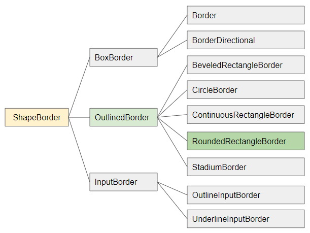
- ShapeBorder
- OutlinedBorder
- Border
- CircleBorder
- ContinuousRectangleBorder
- StadiumBorder
- BoxBorder
- InputBorder
- BorderDirectional
- BeveledRectangleBorder
- OutlineInputBorder
- UnderlineInputBorder
RoundedRectangleBorder constructor
const RoundedRectangleBorder(
    {BorderSide side: BorderSide.none,
    BorderRadiusGeometry borderRadius: BorderRadius.zero}
)
2. Examples
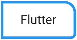
Ví dụ: Sử dụng RoundedRectangleBorder cho một Container.
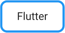
(ex1)
Container(
  width: 300,
  height: 150,
  decoration: ShapeDecoration(
      color: Colors.white,
      shape: RoundedRectangleBorder (
          borderRadius: BorderRadius.circular(32.0),
          side: BorderSide(
              width: 10,
              color: Colors.blue
          )
      )
  ),
  child: Center(
      child: Text(
          "Flutter",
          style: TextStyle(fontSize: 50)
      )
  ),
)
Sử dụng toán tử cộng ( + ) để cộng 2 ShapeBorder để tạo ra một viền kết hợp:
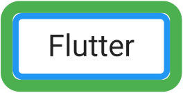
(ex2)
Container(
width: 300,
height: 150,
decoration: ShapeDecoration(
color: Colors.white,
shape: RoundedRectangleBorder (
borderRadius: BorderRadius.circular(16.0),
side: BorderSide(
width: 10,
color: Colors.blue
)
) + RoundedRectangleBorder (
borderRadius: BorderRadius.circular(32.0),
side: BorderSide(
width: 20,
color: Colors.green
)
)
),
child: Center(
child: Text(
"Flutter",
style: TextStyle(fontSize: 50)
)
),
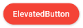
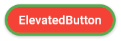
)Ví dụ: Sử dụng RoundedRectangleBorder để định hình dạng cho một ElevatedButton:
ElevatedButton(
  child: Text("ElevatedButton"),
  onPressed: () {},
  style: ElevatedButton.styleFrom( // returns ButtonStyle
    primary: Colors.red,
    onPrimary: Colors.white,
    shape: RoundedRectangleBorder(
      borderRadius: BorderRadius.circular(32.0),
    ),
  ),
)
Chú ý: Property RoundedRectangleBorder.side sẽ không làm việc với ElevatedButton, TextButton và OutlinedButton, nó bị ghi đè (override) bởi ButtonStyle.side.
ElevatedButton(
  child: Text("ElevatedButton"),
  onPressed: () {},
  style: ElevatedButton.styleFrom( // returns ButtonStyle
    primary: Colors.red,
    onPrimary: Colors.white,
    side: BorderSide(color: Colors.green, width: 3), //  Work!
    shape: RoundedRectangleBorder(
        borderRadius: BorderRadius.circular(32.0),
        side: BorderSide(color: Colors.yellow, width: 3) // (Not working - Read note!!)
    ),
  ),
)
ElevatedButton.icon(
  icon: Icon(Icons.thumb_up),
  label: Text("Like"),
  onPressed: () {},
  style: ElevatedButton.styleFrom( // returns ButtonStyle
    shape: RoundedRectangleBorder(
      borderRadius: BorderRadius.circular(32.0),
    ),
  ),
)
// with side:
ElevatedButton.icon(
  icon: Icon(Icons.thumb_up),
  label: Text("Like"),
  onPressed: () {},
  style: ElevatedButton.styleFrom( // returns ButtonStyle
    side: BorderSide(color: Colors.green, width: 3),
    shape: RoundedRectangleBorder(
      borderRadius: BorderRadius.circular(32.0),
    ),
  ),
)
OutlinedButton.icon (
  icon: Icon(Icons.star_outline),
  label: Text("OutlinedButton"),
  onPressed: () {},
  style: ElevatedButton.styleFrom( // returns ButtonStyle
    shape: RoundedRectangleBorder(
      borderRadius: BorderRadius.circular(32.0),
    ),
  ),
)
// with side:
OutlinedButton.icon (
  icon: Icon(Icons.star_outline),
  label: Text("OutlinedButton"),
  onPressed: () {},
  style: ElevatedButton.styleFrom( // returns ButtonStyle
    side: BorderSide(width: 2.0, color: Colors.green),
    shape: RoundedRectangleBorder(
      borderRadius: BorderRadius.circular(32.0),
    ),
  ),
)
3. side
side - Cung cấp các thông số liên quan tới viền chẳng hạn như mầu sắc, chiều rộng, kiểu dáng.
BorderSide side: BorderSide.noneBorderSide constructor
const BorderSide (
    {Color color: const Color(0xFF000000),
    double width: 1.0,
    BorderStyle style: BorderStyle.solid}
)- Hướng dẫn và ví dụ Flutter BorderSide
Chú ý: Property RoundedRectangleBorder.side sẽ không làm việc với ElevatedButton, TextButton và OutlinedButton, nó bị ghi đè (override) bởi ButtonStyle.side. (Xem thêm ví dụ ở phía trên).
4. borderRadius
borderRadius - cung cấp giá trị bán kính 4 góc của hình chữ nhật.
BorderRadiusGeometry borderRadius: BorderRadius.zero- Hướng dẫn và ví dụ Flutter BorderRadiusGeometry
borderRadius (ex1)
Container(
  width: 300,
  height: 150,
  decoration: ShapeDecoration(
      color: Colors.white,
      shape: RoundedRectangleBorder (
          borderRadius: BorderRadius.only(
              bottomLeft: Radius.zero,
              topLeft:   Radius.zero,
              bottomRight: Radius.circular(20),
              topRight: Radius.circular(45)
          ),
          side: BorderSide(
              width: 10,
              color: Colors.blue
          )
      )
  ),
  child: Center(
      child: Text(
          "Flutter",
          style: TextStyle(fontSize: 50)
      )
  ),
)
Các hướng dẫn lập trình Flutter
- Hướng dẫn và ví dụ Flutter Column
- Hướng dẫn và ví dụ Flutter Stack
- Hướng dẫn và ví dụ Flutter IndexedStack
- Hướng dẫn và ví dụ Flutter Spacer
- Hướng dẫn và ví dụ Flutter Expanded
- Hướng dẫn và ví dụ Flutter SizedBox
- Hướng dẫn và ví dụ Flutter Tween
- Cài đặt Flutter SDK trên Windows
- Cài đặt Flutter Plugin cho Android Studio
- Tạo ứng dụng Flutter đầu tiên của bạn - Hello Flutter
- Hướng dẫn và ví dụ Flutter Scaffold
- Hướng dẫn và ví dụ Flutter AppBar
- Hướng dẫn và ví dụ Flutter BottomAppBar
- Hướng dẫn và ví dụ Flutter SliverAppBar
- Hướng dẫn và ví dụ Flutter TextButton
- Hướng dẫn và ví dụ Flutter ElevatedButton
- Hướng dẫn và ví dụ Flutter ShapeBorder
- Hướng dẫn và ví dụ Flutter EdgeInsetsGeometry
- Hướng dẫn và ví dụ Flutter EdgeInsets
- Hướng dẫn và ví dụ Flutter CircularProgressIndicator
- Hướng dẫn và ví dụ Flutter LinearProgressIndicator
- Hướng dẫn và ví dụ Flutter Center
- Hướng dẫn và ví dụ Flutter Align
- Hướng dẫn và ví dụ Flutter Row
- Hướng dẫn và ví dụ Flutter SplashScreen
- Hướng dẫn và ví dụ Flutter Alignment
- Hướng dẫn và ví dụ Flutter Positioned
- Hướng dẫn và ví dụ Flutter ListTile
- Hướng dẫn và ví dụ Flutter SimpleDialog
- Hướng dẫn và ví dụ Flutter AlertDialog
- Navigation và Routing trong Flutter
- Hướng dẫn và ví dụ Flutter Navigator
- Hướng dẫn và ví dụ Flutter TabBar
- Hướng dẫn và ví dụ Flutter Banner
- Hướng dẫn và ví dụ Flutter BottomNavigationBar
- Hướng dẫn và ví dụ Flutter FancyBottomNavigation
- Hướng dẫn và ví dụ Flutter Card
- Hướng dẫn và ví dụ Flutter Border
- Hướng dẫn và ví dụ Flutter ContinuousRectangleBorder
- Hướng dẫn và ví dụ Flutter RoundedRectangleBorder
- Hướng dẫn và ví dụ Flutter CircleBorder
- Hướng dẫn và ví dụ Flutter StadiumBorder
- Hướng dẫn và ví dụ Flutter Container
- Hướng dẫn và ví dụ Flutter RotatedBox
- Hướng dẫn và ví dụ Flutter CircleAvatar
- Hướng dẫn và ví dụ Flutter TextField
- Hướng dẫn và ví dụ Flutter IconButton
- Hướng dẫn và ví dụ Flutter FlatButton
- Hướng dẫn và ví dụ Flutter SnackBar
- Hướng dẫn và ví dụ Flutter Drawer
- Ví dụ Flutter Navigator pushNamedAndRemoveUntil
- Hiển thị hình ảnh trên Internet trong Flutter
- Hiển thị ảnh Asset trong Flutter
- Flutter TextInputType các kiểu bàn phím
- Hướng dẫn và ví dụ Flutter NumberTextInputFormatter
- Hướng dẫn và ví dụ Flutter Builder
- Làm sao xác định chiều rộng của Widget cha trong Flutter
- Bài thực hành Flutter thiết kế giao diện màn hình đăng nhập
- Bài thực hành Flutter thiết kế giao diện trang (1)
- Khuôn mẫu thiết kế Flutter với các lớp trừu tượng
- Bài thực hành Flutter thiết kế trang Profile với Stack
- Bài thực hành Flutter thiết kế trang profile (2)
- Hướng dẫn và ví dụ Flutter ListView
- Hướng dẫn và ví dụ Flutter GridView
- Bài thực hành Flutter với gói http và dart:convert (2)
- Bài thực hành Flutter với gói http và dart:convert (1)
- Ứng dụng Flutter Responsive với Menu Drawer
- Flutter GridView với SliverGridDelegate tuỳ biến
- Hướng dẫn và ví dụ Flutter image_picker
- Flutter upload ảnh sử dụng http và ImagePicker
- Hướng dẫn và ví dụ Flutter SharedPreferences
- Chỉ định cổng cố định cho Flutter Web trên Android Studio
- Tạo Module trong Flutter
- Hướng dẫn và ví dụ Flutter SkeletonLoader
- Hướng dẫn và ví dụ Flutter Slider
- Hướng dẫn và ví dụ Flutter Radio
- Bài thực hành Flutter SharedPreferences
- Hướng dẫn và ví dụ Flutter InkWell
- Hướng dẫn và ví dụ Flutter GetX GetBuilder
- Hướng dẫn và ví dụ Flutter GetX obs Obx
- Hướng dẫn và ví dụ Flutter flutter_form_builder
- Xử lý lỗi 404 trong Flutter GetX
- Flutter BloC cho người mới bắt đầu
- Ví dụ đăng nhập và đăng xuất với Flutter Getx
- Hướng dẫn và ví dụ Flutter multi_dropdown
Show More