Hướng dẫn và ví dụ Flutter AlertDialog
1. AlertDialog
AlertDialog là một hộp thoại (dialog) được sử dụng để thông báo cho người dùng các tình huống yêu cầu xác nhận. Nó bao gồm một tiêu đề tuỳ chọn, một nội dung tuỳ chọn và các nút hành động (action button) tuỳ chọn bên dưới nội dung.
Nếu nội dung quá lớn so với màn hình theo chiều dọc bạn có thể gói nó trong một SingleChildScrollView để tránh tràn. Tuy nhiên lưu ý rằng AlertDialog cố gắng tự định kích thước của nó dựa trên kích thước nội tại của các con của nó, vì vậy các widget con như ListView, GridView và CustomScrollView nên được cân nhắc sử dụng khi tạo ra nội dung.
Chế độ hiển thị dữ liệu lười biếng không hoạt động trong AlertDialog, nếu đây là vấn đề bạn có thể chuyển sang sử dụng lớp Dialog một cách trực tiếp để có nhiều không gian sáng tạo hơn.
- Hướng dẫn và ví dụ Flutter Dialog
Nếu bạn muốn có một dialog đơn giản chỉ bao gồm tiêu đề và một danh sách các lựa chọn, hãy xem xét sử dụng SimpleDialog.
AlertDialog Constructor:
AlertDialog Constructor
const AlertDialog(
    {Key key,
    Widget title,
    Widget content,
    List<Widget> actions,
    ShapeBorder shape,
    double elevation,
    EdgeInsetsGeometry titlePadding,
    TextStyle titleTextStyle,
    EdgeInsetsGeometry contentPadding: const EdgeInsets.fromLTRB(24.0, 20.0, 24.0, 24.0),
    TextStyle contentTextStyle,
    EdgeInsetsGeometry actionsPadding: EdgeInsets.zero,
    VerticalDirection actionsOverflowDirection,
    double actionsOverflowButtonSpacing,
    EdgeInsetsGeometry buttonPadding,
    Color backgroundColor,
    String semanticLabel,
    EdgeInsets insetPadding: _defaultInsetPadding,
    Clip clipBehavior: Clip.none,
    bool scrollable: false}
)
2. Examples
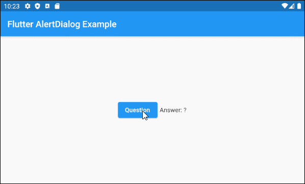
Trước hết hãy xem một ví dụ đơn giản nhưng hoàn chỉnh về AlertDialog, và nó giúp bạn trả lời các câu hỏi cơ bản dưới đây:
- Làm thế nào để tạo một AlertDialog.
- Làm sao để trả về một giá trị từ AlertDialog.
- Làm sao để xử lý giá trị trả về.
main.dart (ex1)
import 'package:flutter/material.dart';

void main() {
  runApp(MyApp());
}

class MyApp extends StatelessWidget {
  @override
  Widget build(BuildContext context) {
    return MaterialApp(
      title: 'o7planning.org',
      debugShowCheckedModeBanner: false,
      theme: ThemeData(
        primarySwatch: Colors.blue,
        visualDensity: VisualDensity.adaptivePlatformDensity,
      ),
      home: MyHomePage(),
    );
  }
}

class MyHomePage extends StatefulWidget {
  MyHomePage({Key key}) : super(key: key);

  @override
  State<StatefulWidget> createState() {
    return MyHomePageState();
  }
}

class MyHomePageState extends State<MyHomePage> {
  String answer = "?";

  @override
  Widget build(BuildContext context) {
    return Scaffold (
        appBar: AppBar(
            title: Text("Flutter AlertDialog Example")
        ),
        body: Center (
            child: Row (
                mainAxisAlignment: MainAxisAlignment.center,
                crossAxisAlignment: CrossAxisAlignment.center,
                children: [
                  ElevatedButton (
                    child: Text("Question"),
                    onPressed: () {
                      showMyAlertDialog(context);
                    },
                  ),
                  SizedBox(width:5, height:5),
                  Text("Answer: " + this.answer.toString())
                ]
            )
        )
    );
  }

  showMyAlertDialog(BuildContext context) {
    // Create AlertDialog
    AlertDialog dialog = AlertDialog(
      title: Text("Election 2020"),
      content: Text("Will you vote for Trump?"),
      actions: [
        ElevatedButton(
            child: Text("Yes"),
            onPressed: (){
              Navigator.of(context).pop("Yes, Of course!"); // Return value
            }
        ),
        ElevatedButton(
            child: Text("No"),
            onPressed: (){
              Navigator.of(context).pop("No, I will vote for Biden"); // Return value
            }
        ),
      ],
    );

    // Call showDialog function to show dialog.
    Future<String> futureValue = showDialog(
        context: context,
        builder: (BuildContext context) {
          return dialog;
        }
    );
    Stream<String> stream = futureValue.asStream();
    stream.listen((String data) {
      String answerValue = data;
      this.setState(() {
        this.answer = answerValue;
      });
    }, onDone : () {
      print("Done!");
    } , onError: (error) {
      print("Error! " + error.toString());
    });
  }

}3. shape
Property shape được sử dụng để định nghĩa hình dạng đường viền của AlertDialog. Giá trị mặc định của shape là một RoundedRectangleBorder với bán kính tại 4 góc là 4.0 pixel.
ShapeBorder shape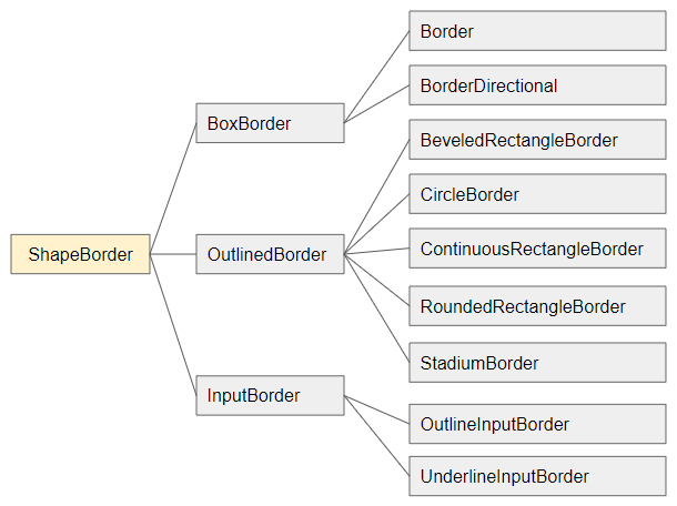
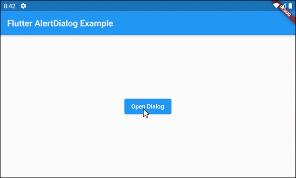
shape (ex1)
void openMyAlertDialog(BuildContext context)  {
  // Create a AlertDialog.
  AlertDialog dialog = AlertDialog(
    title: Text("Confirm"),
    content: Text("Are you sure to remove this item?"),
    shape: RoundedRectangleBorder(
        side:  BorderSide(color: Colors.green,width: 3),
        borderRadius: BorderRadius.all(Radius.circular(15))
    ),
    actions: [
      ElevatedButton(
          child: Text("Yes Delete"),
          onPressed: (){
            Navigator.of(context).pop(true); // Return true
          }
      ),
      ElevatedButton(
          child: Text("Cancel"),
          onPressed: (){
            Navigator.of(context).pop(false); // Return false
          }
      ),
    ],
  );

  // Call showDialog function.
  Future<bool> futureValue = showDialog(
      context: context,
      builder: (BuildContext context) {
        return dialog;
      }
  );
  futureValue.then( (value) {
    print("Return value: " + value.toString()); // true/false
  });
}
4. elevation
Property elevation định nghĩa tọa độ theo trục Z của AlertDialog, giá trị mặc định của nó là 24.0 pixel.
double elevation5. title
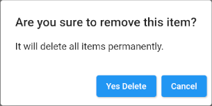
Property title là một tùy chọn để thiết lập tiêu đề cho AlertDialog, trong hầu hết các trường hợp sử dụng nó là một đối tượng Text.
Widget titleMột ví dụ đơn giản với title là một đối tượng Text:
title (ex1)
void openMyAlertDialog(BuildContext context)  {
  // Create a AlertDialog.
  AlertDialog dialog = AlertDialog(
    title: Text("Are you sure to remove this item?"),
    content: Text("It will delete all items permanently."),
    actions: [
      ElevatedButton(
          child: Text("Yes Delete"),
          onPressed: (){
            Navigator.of(context).pop(true); // Return true
          }
      ),
      ElevatedButton(
          child: Text("Cancel"),
          onPressed: (){
            Navigator.of(context).pop(false); // Return false
          }
      ),
    ],
  );

  // Call showDialog function.
  Future<bool> futureValue = showDialog(
      context: context,
      builder: (BuildContext context) {
        return dialog;
      }
  );
  futureValue.then( (value) {
      print("Return value: " + value.toString()); // true/false
  });
}
Và một ví dụ khác với title phức tạp hơn:
title (ex2)
void openMyAlertDialog(BuildContext context) {
// Create a AlertDialog.
AlertDialog dialog = AlertDialog(
title: Row (
children: [
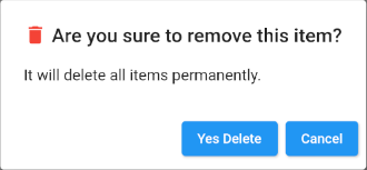
Icon(Icons.delete, color: Colors.red),
SizedBox(width: 5, height: 5),
Text("Are you sure to remove this item?"),
]
),
content: Text("It will delete all items permanently."),
actions: [
ElevatedButton(
child: Text("Yes Delete"),
onPressed: (){
Navigator.of(context).pop(true); // Return true
}
),
ElevatedButton(
child: Text("Cancel"),
onPressed: (){
Navigator.of(context).pop(false); // Return false
}
),
],
);
// Call showDialog function.
Future<bool> futureValue = showDialog(
context: context,
builder: (BuildContext context) {
return dialog;
}
);
futureValue.then( (value) {
print("Return value: " + value.toString()); // true/false
});
}6. titlePadding
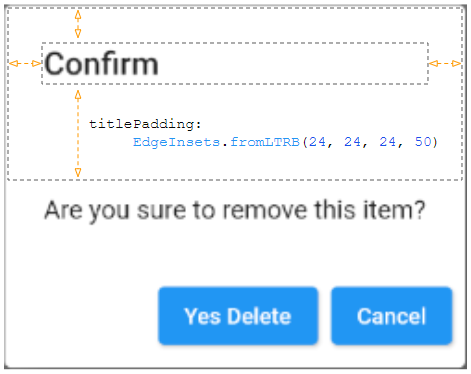
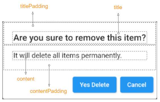
Property titlePadding được sử dụng để thêm một padding (khoảng đệm) xung quanh tiêu đề của AlertDialog. Nếu title là null thì titlePadding sẽ không được sử dụng.
Theo mặc định titlePadding cung cấp 24 pixel ở trên cùng, bên trái và bên phải của tiêu đề, nó cũng cung cấp 20 pixel bên dưới tiêu đề nếu content là null.

EdgeInsetsGeometry titlePadding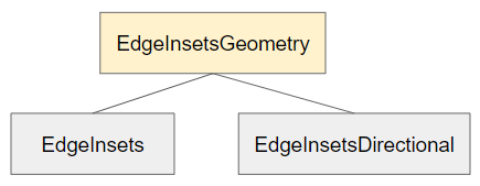
Ví dụ:
titlePadding (ex1)
void openMyAlertDialog(BuildContext context)  {
  // Create a AlertDialog.
  AlertDialog dialog = AlertDialog(
    title: Text("Confirm"),
    titlePadding: EdgeInsets.fromLTRB(24, 24, 24, 50),
    content: Text("Are you sure to remove this item?"),
    actions: [
      ElevatedButton(
          child: Text("Yes Delete"),
          onPressed: (){
            Navigator.of(context).pop(true); // Return true
          }
      ),
      ElevatedButton(
          child: Text("Cancel"),
          onPressed: (){
            Navigator.of(context).pop(false); // Return false
          }
      ),
    ],
  );

  // Call showDialog function.
  Future<bool> futureValue = showDialog(
      context: context,
      builder: (BuildContext context) {
        return dialog;
      }
  );
  futureValue.then( (value) {
    print("Return value: " + value.toString()); // true/false
  });
}
7. titleTextStyle
Property titleTextStyle được sử dụng để định nghĩa kiểu dáng cho văn bản của vùng title.
TextStyle titleTextStyle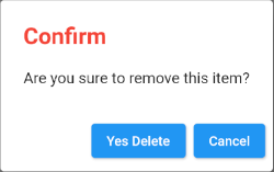
titleTextStyle (ex1)
void openMyAlertDialog(BuildContext context)  {
  // Create a AlertDialog.
  AlertDialog dialog = AlertDialog(
    title: Text("Confirm"),
    titleTextStyle: TextStyle(color: Colors.red, fontSize: 24),
    content: Text("Are you sure to remove this item?"),
    actions: [
      ElevatedButton(
          child: Text("Yes Delete"),
          onPressed: (){
            Navigator.of(context).pop(true); // Return true
          }
      ),
      ElevatedButton(
          child: Text("Cancel"),
          onPressed: (){
            Navigator.of(context).pop(false); // Return false
          }
      ),
    ],
  );

  // Call showDialog function.
  Future<bool> futureValue = showDialog(
      context: context,
      builder: (BuildContext context) {
        return dialog;
      }
  );
  futureValue.then( (value) {
    print("Return value: " + value.toString()); // true/false
  });
}
8. content
Property content là một tùy chọn để định nghĩa một nội dung hiển thị ở trung tâm của AlertDialog, nó nên là một đối tượng SingleChildScrollView nếu nội dung dài.
Widget content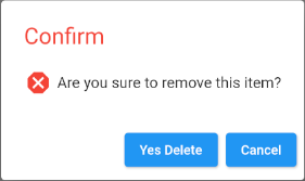
content (ex1)
void openMyAlertDialog(BuildContext context)  {
  // Create a AlertDialog.
  AlertDialog dialog = AlertDialog(
    title: Text("Confirm"),
    titleTextStyle: TextStyle(color: Colors.red, fontSize: 24),
    content: Row (
        children: [
          Icon(Icons.dangerous, size: 30, color: Colors.red),
          SizedBox(width:5, height:5),
          Text("Are you sure to remove this item?")
        ]
    ),
    actions: [
      ElevatedButton(
          child: Text("Yes Delete"),
          onPressed: (){
            Navigator.of(context).pop(true); // Return true
          }
      ),
      ElevatedButton(
          child: Text("Cancel"),
          onPressed: () {
            Navigator.of(context).pop(false); // Return false
          }
      ),
    ],
  );

  // Call showDialog function.
  Future<bool> futureValue = showDialog(
      context: context,
      builder: (BuildContext context) {
        return dialog;
      }
  );
  futureValue.then( (value) {
    print("Return value: " + value.toString()); // true/false
  });
}- Hướng dẫn và ví dụ Flutter SingleChildScrollView
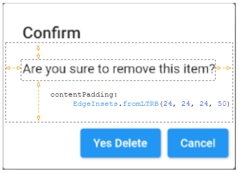
9. contentPadding
Property contentPadding được sử dụng để thêm một padding (khoảng đệm) xung quanh content của AlertDialog. Nếu content là null thì contentPadding sẽ không được sử dụng.
Theo mặc định contentPadding cung cấp 20 pixel ở trên cùng của content, 24 pixel ở bên trái, phải và bên dưới của content.
EdgeInsetsGeometry contentPadding: const EdgeInsets.fromLTRB(24.0, 20.0, 24.0, 24.0)
contentPadding (ex1)
void openMyAlertDialog(BuildContext context)  {
  // Create a AlertDialog.
  AlertDialog dialog = AlertDialog(
    title: Text("Confirm"),
    content: Text("Are you sure to remove this item?"),
    contentPadding: EdgeInsets.fromLTRB(24, 24, 24, 50),
    actions: [
      ElevatedButton(
          child: Text("Yes Delete"),
          onPressed: (){
            Navigator.of(context).pop(true); // Return true
          }
      ),
      ElevatedButton(
          child: Text("Cancel"),
          onPressed: (){
            Navigator.of(context).pop(false); // Return false
          }
      ),
    ],
  );

  // Call showDialog function.
  Future<bool> futureValue = showDialog(
      context: context,
      builder: (BuildContext context) {
        return dialog;
      }
  );
  futureValue.then( (value) {
    print("Return value: " + value.toString()); // true/false
  });
}
10. contentTextStyle
Property contentTextStyle được sử dụng để định nghĩa kiểu dáng cho văn bản của vùng content.
TextStyle contentTextStyle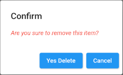
contentTextStyle (ex1)
void openMyAlertDialog(BuildContext context)  {
  // Create a AlertDialog.
  AlertDialog dialog = AlertDialog(
    title: Text("Confirm"),
    content: Text("Are you sure to remove this item?"),
    contentTextStyle: TextStyle(color: Colors.red, fontStyle: FontStyle.italic),
    actions: [
      ElevatedButton(
          child: Text("Yes Delete"),
          onPressed: (){
            Navigator.of(context).pop(true); // Return true
          }
      ),
      ElevatedButton(
          child: Text("Cancel"),
          onPressed: (){
            Navigator.of(context).pop(false); // Return false
          }
      ),
    ],
  );

  // Call showDialog function.
  Future<bool> futureValue = showDialog(
      context: context,
      builder: (BuildContext context) {
        return dialog;
      }
  );
  futureValue.then( (value) {
    print("Return value: " + value.toString()); // true/false
  });
}
11. actions
Property actions là một tùy chọn để định nghĩa các nút hành động nằm ở dưới cùng của AlertDialog. Một cách cụ thể nó là một danh sách các TextButton hoặc ElevatedButton được gói trong một ButtonBar.
List<Widget> actions- Hướng dẫn và ví dụ Flutter ButtonBar
12. actionsPadding
Property actionsPadding được sử dụng để thêm một padding (khoảng đệm) xung quanh ButtonBar của AlertDialog. Nếu actions là null thì actionsPadding sẽ không được sử dụng. Giá trị mặc định của actionsPadding là EdgeInsets.zero (0,0,0,0).
Thay vì sử dụng property actionsPadding bạn có thể sử dụng property buttonPadding để tạo ra các khoảng đệm (padding) xung quanh từng button.
EdgeInsetsGeometry actionsPadding: EdgeInsets.zero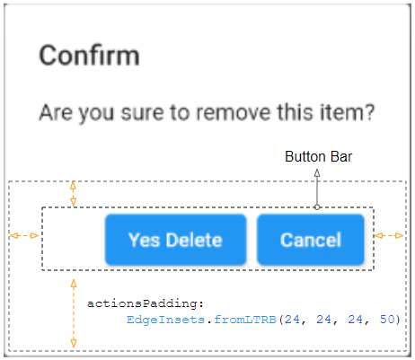
actionsPadding (ex1)
void openMyAlertDialog(BuildContext context)  {
  // Create a AlertDialog.
  AlertDialog dialog = AlertDialog(
    title: Text("Confirm"),
    content: Text("Are you sure to remove this item?"),
    actions: [
      ElevatedButton(
          child: Text("Yes Delete"),
          onPressed: (){
            Navigator.of(context).pop(true); // Return true
          }
      ),
      ElevatedButton(
          child: Text("Cancel"),
          onPressed: (){
            Navigator.of(context).pop(false); // Return false
          }
      )
    ],
    actionsPadding: EdgeInsets.fromLTRB(24, 24, 24, 50),
  );

  // Call showDialog function.
  Future<bool> futureValue = showDialog(
      context: context,
      builder: (BuildContext context) {
        return dialog;
      }
  );
  futureValue.then( (value) {
    print("Return value: " + value.toString()); // true/false
  });
}
13. actionsOverflowDirection
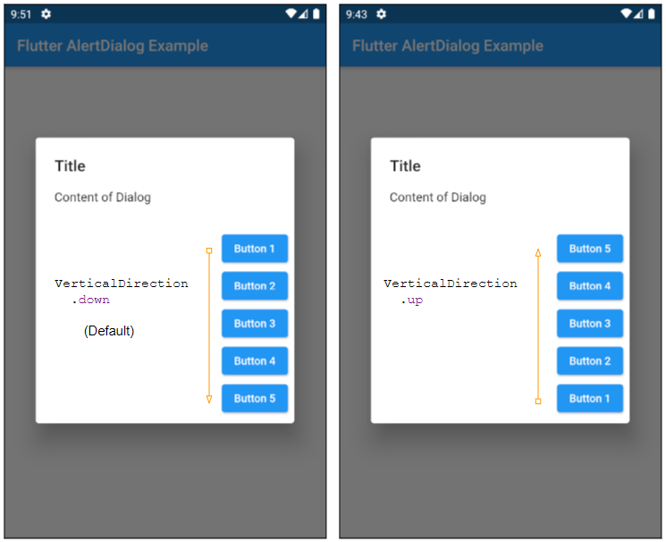
Thông thường các actions được đặt trên một hàng, nhưng nếu không gian nằm ngang không đủ chúng sẽ được đặt trên một cột. Property actionsOverflowDirection sẽ chỉ định cách xắp xếp chúng trên một cột. Từ trên xuống dưới (Mặc định) hay từ dưới lên trên.
VerticalDirection actionsOverflowDirection

// enum VerticalDirection

    VerticalDirection.up
    VerticalDirection.down  (Default)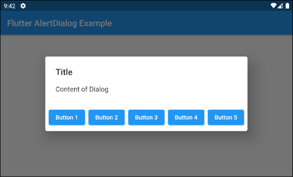
- actionsOverflowDirection: VerticalDirection.up
- actionsOverflowDirection: VerticalDirection.down (Default)
14. actionsOverflowButtonSpacing
Thông thường các actions được đặt trên một hàng, nhưng nếu không gian nằm ngang không đủ chúng sẽ được đặt trên một cột. Property actionsOverflowButtonSpacing chỉ định khoảng không gian giữa các actions theo phương thẳng đứng.
double actionsOverflowButtonSpacing16. backgroundColor
Property backgroundColor được sử dụng để chỉ định mầu nền cho AlertDialog.
Color backgroundColor19. semanticLabel
semanticLabel (nhãn ngữ nghĩa) là một văn bản mô tả về AlertDialog, nó không hiển thị trên giao diện người dùng. Khi người dùng mở hoặc đóng AlertDialog hệ thống sẽ đọc mô tả này cho người dùng nghe nếu chế độ trợ năng (accessibility mode) đang được bật.
String semanticLabel20. scrollable
Property scrollable đã lỗi thời và không còn được sử dụng nữa.
@Deprecated(
 'Set scrollable to `true`. This parameter will be removed and '
 'was introduced to migrate AlertDialog to be scrollable by '
 'default. For more information, see '
 'https://flutter.dev/docs/release/breaking-changes/scrollable_alert_dialog. '
 'This feature was deprecated after v1.13.2.'
)
bool scrollable: false
Các hướng dẫn lập trình Flutter
- Hướng dẫn và ví dụ Flutter Column
- Hướng dẫn và ví dụ Flutter Stack
- Hướng dẫn và ví dụ Flutter IndexedStack
- Hướng dẫn và ví dụ Flutter Spacer
- Hướng dẫn và ví dụ Flutter Expanded
- Hướng dẫn và ví dụ Flutter SizedBox
- Hướng dẫn và ví dụ Flutter Tween
- Cài đặt Flutter SDK trên Windows
- Cài đặt Flutter Plugin cho Android Studio
- Tạo ứng dụng Flutter đầu tiên của bạn - Hello Flutter
- Hướng dẫn và ví dụ Flutter Scaffold
- Hướng dẫn và ví dụ Flutter AppBar
- Hướng dẫn và ví dụ Flutter BottomAppBar
- Hướng dẫn và ví dụ Flutter SliverAppBar
- Hướng dẫn và ví dụ Flutter TextButton
- Hướng dẫn và ví dụ Flutter ElevatedButton
- Hướng dẫn và ví dụ Flutter ShapeBorder
- Hướng dẫn và ví dụ Flutter EdgeInsetsGeometry
- Hướng dẫn và ví dụ Flutter EdgeInsets
- Hướng dẫn và ví dụ Flutter CircularProgressIndicator
- Hướng dẫn và ví dụ Flutter LinearProgressIndicator
- Hướng dẫn và ví dụ Flutter Center
- Hướng dẫn và ví dụ Flutter Align
- Hướng dẫn và ví dụ Flutter Row
- Hướng dẫn và ví dụ Flutter SplashScreen
- Hướng dẫn và ví dụ Flutter Alignment
- Hướng dẫn và ví dụ Flutter Positioned
- Hướng dẫn và ví dụ Flutter ListTile
- Hướng dẫn và ví dụ Flutter SimpleDialog
- Hướng dẫn và ví dụ Flutter AlertDialog
- Navigation và Routing trong Flutter
- Hướng dẫn và ví dụ Flutter Navigator
- Hướng dẫn và ví dụ Flutter TabBar
- Hướng dẫn và ví dụ Flutter Banner
- Hướng dẫn và ví dụ Flutter BottomNavigationBar
- Hướng dẫn và ví dụ Flutter FancyBottomNavigation
- Hướng dẫn và ví dụ Flutter Card
- Hướng dẫn và ví dụ Flutter Border
- Hướng dẫn và ví dụ Flutter ContinuousRectangleBorder
- Hướng dẫn và ví dụ Flutter RoundedRectangleBorder
- Hướng dẫn và ví dụ Flutter CircleBorder
- Hướng dẫn và ví dụ Flutter StadiumBorder
- Hướng dẫn và ví dụ Flutter Container
- Hướng dẫn và ví dụ Flutter RotatedBox
- Hướng dẫn và ví dụ Flutter CircleAvatar
- Hướng dẫn và ví dụ Flutter TextField
- Hướng dẫn và ví dụ Flutter IconButton
- Hướng dẫn và ví dụ Flutter FlatButton
- Hướng dẫn và ví dụ Flutter SnackBar
- Hướng dẫn và ví dụ Flutter Drawer
- Ví dụ Flutter Navigator pushNamedAndRemoveUntil
- Hiển thị hình ảnh trên Internet trong Flutter
- Hiển thị ảnh Asset trong Flutter
- Flutter TextInputType các kiểu bàn phím
- Hướng dẫn và ví dụ Flutter NumberTextInputFormatter
- Hướng dẫn và ví dụ Flutter Builder
- Làm sao xác định chiều rộng của Widget cha trong Flutter
- Bài thực hành Flutter thiết kế giao diện màn hình đăng nhập
- Bài thực hành Flutter thiết kế giao diện trang (1)
- Khuôn mẫu thiết kế Flutter với các lớp trừu tượng
- Bài thực hành Flutter thiết kế trang Profile với Stack
- Bài thực hành Flutter thiết kế trang profile (2)
- Hướng dẫn và ví dụ Flutter ListView
- Hướng dẫn và ví dụ Flutter GridView
- Bài thực hành Flutter với gói http và dart:convert (2)
- Bài thực hành Flutter với gói http và dart:convert (1)
- Ứng dụng Flutter Responsive với Menu Drawer
- Flutter GridView với SliverGridDelegate tuỳ biến
- Hướng dẫn và ví dụ Flutter image_picker
- Flutter upload ảnh sử dụng http và ImagePicker
- Hướng dẫn và ví dụ Flutter SharedPreferences
- Chỉ định cổng cố định cho Flutter Web trên Android Studio
- Tạo Module trong Flutter
- Hướng dẫn và ví dụ Flutter SkeletonLoader
- Hướng dẫn và ví dụ Flutter Slider
- Hướng dẫn và ví dụ Flutter Radio
- Bài thực hành Flutter SharedPreferences
- Hướng dẫn và ví dụ Flutter InkWell
- Hướng dẫn và ví dụ Flutter GetX GetBuilder
- Hướng dẫn và ví dụ Flutter GetX obs Obx
- Hướng dẫn và ví dụ Flutter flutter_form_builder
- Xử lý lỗi 404 trong Flutter GetX
- Flutter BloC cho người mới bắt đầu
- Ví dụ đăng nhập và đăng xuất với Flutter Getx
- Hướng dẫn và ví dụ Flutter multi_dropdown
Show More