Hướng dẫn và ví dụ Flutter TabBar
1. Flutter Tab
TAB là một bố cục giao diện được sử dụng rộng rãi trong các nền tảng (framework) ứng dụng khác nhau, và Flutter cũng không phải là một ngoại lệ. Flutter cung cấp một cách dễ dàng để bạn tạo một bố cục TAB với thư viện Material.
Về cơ bản để tạo được một bố cục TAB trong Flutter bạn cần thực hiện các bước sau:
- Tạo một TabController.
- Tạo một TabBar.
- Tạo một TabBarView.
TabController
Để bố cục TAB hoạt động, bạn cần đồng bộ hóa giữa Tab được lựa chọn và nội dung của nó, đây là công việc của TabController.
Bạn có thể tạo một TabController một cách thủ công, hoặc sử dụng một Widget sẵn có là DefaultTabController, nó hỗ trợ sẵn các tính năng thông dụng.
TabController
DefaultTabController(
  // The number of tabs / content sections to display.
  length: 3,
  child: // Complete this code in the next step.
);
TabBar
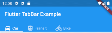
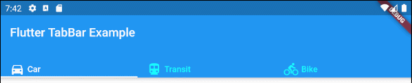
TabBar giúp bạn tạo ra các Tab, chẳng hạn dưới đây là một TabBar chứa 3 Tab con.
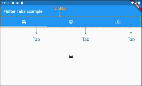
TabBar
DefaultTabController(
  length: 3,
  child: Scaffold(
    appBar: AppBar(
      bottom: TabBar(
        tabs: [
          Tab(icon: Icon(Icons.directions_car)),
          Tab(icon: Icon(Icons.directions_transit)),
          Tab(icon: Icon(Icons.directions_bike)),
        ],
      ),
    ),
  ),
);
Chú ý: Bạn có thể đặt nhiều TabBar vào một DefaultTabController, nhưng DefaultTabController sẽ chỉ làm việc với TabBar gần nó nhất (Tìm theo cấu trúc cây). Vì vậy trong trường hợp này bạn cần cân nhắc tạo ra một TabController của riêng mình một cách thủ công.
TabBarView
Sử dụng TabBarView để chứa các nội dung tương ứng với mỗi Tab trên TabBar.
TabBarView
TabBarView (
children: [
Icon(Icons.directions_car),
Icon(Icons.directions_transit),
Icon(Icons.directions_bike),
],
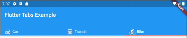
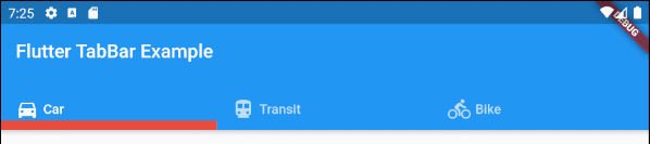
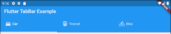
);2. TabBar example
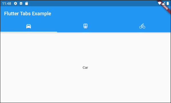
main.dart (ex1)
import 'package:flutter/material.dart';

void main() {
  runApp(MyApp());
}

class MyApp extends StatelessWidget {
  // This widget is the root of your application.
  @override
  Widget build(BuildContext context) {
    return MaterialApp(
      title: 'Title of Application',
      theme: ThemeData(
        primarySwatch: Colors.blue,
        visualDensity: VisualDensity.adaptivePlatformDensity,
      ),
      home: MyHomePage(),
    );
  }
}

class MyHomePage extends StatelessWidget {
  MyHomePage({Key key}) : super(key: key);

  @override
  Widget build(BuildContext context) {
    return DefaultTabController(
        length: 3,
        child: Scaffold(
          appBar: AppBar(
            bottom: TabBar(
              tabs: [
                Tab(icon: Icon(Icons.directions_car)),
                Tab(icon: Icon(Icons.directions_transit)),
                Tab(icon: Icon(Icons.directions_bike)),
              ],
            ),
            title: Text('Flutter Tabs Example'),
          ),
          body: TabBarView(
            children: [
              Center(child: Text("Car")),
              Center(child: Text("Transit")),
              Center(child: Text("Bike"))
            ],
          ),
        )
    );
  }
}
3. TabController, TabBar ... Constructor
TabController Constructor
TabController Constructor
TabController(
    {int initialIndex: 0,
    @required int length,
    @required TickerProvider vsync}
)
DefaultTabController Constructor:
DefaultTabController Constructor
const DefaultTabController(
    {Key key,
    @required int length,
    int initialIndex: 0,
    @required Widget child}
)
TabBar Constructor:
TabBar Constructor
const TabBar(
    {Key key,
    @required List<Widget> tabs,
    TabController controller,
    bool isScrollable: false,
    Color indicatorColor,
    double indicatorWeight: 2.0,
    EdgeInsetsGeometry indicatorPadding: EdgeInsets.zero,
    Decoration indicator,
    TabBarIndicatorSize indicatorSize,
    Color labelColor,
    TextStyle labelStyle,
    EdgeInsetsGeometry labelPadding,
    Color unselectedLabelColor,
    TextStyle unselectedLabelStyle,
    DragStartBehavior dragStartBehavior: DragStartBehavior.start,
    MouseCursor mouseCursor,
    ValueChanged<int> onTap,
    ScrollPhysics physics}
)
TabBarView Constructor:
TabBarView Constructor
const TabBarView(
    {Key key,
    @required List<Widget> children,
    TabController controller,
    ScrollPhysics physics,
    DragStartBehavior dragStartBehavior: DragStartBehavior.start}
)
4. isScrollable
Nếu isScrollable là true, mỗi Tab sẽ có chiều rộng vừa đủ với nội dung của nó, và TabBar sẽ có một thanh cuộn nằm ngang.
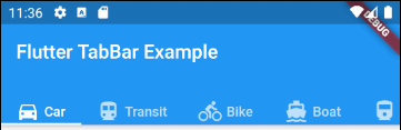
main.dart (isScrollable ex1)
import 'package:flutter/material.dart';

void main() {
  runApp(MyApp());
}

class MyApp extends StatelessWidget {
  // This widget is the root of your application.
  @override
  Widget build(BuildContext context) {
    return MaterialApp(
      title: 'Title of Application',
      theme: ThemeData(
        primarySwatch: Colors.blue,
        visualDensity: VisualDensity.adaptivePlatformDensity,
      ),
      home: MyHomePage(),
    );
  }
}

class MyHomePage extends StatelessWidget {
  MyHomePage({Key key}) : super(key: key);

  @override
  Widget build(BuildContext context) {
    EdgeInsets a2; EdgeInsetsDirectional a;
    return DefaultTabController(
        length: 6,
        child: Scaffold(
          appBar: AppBar(
            bottom: createTabBar(),
            title: Text('Flutter TabBar Example'),
          ),
          body: TabBarView(
            children: [
              Center(child: Text("Car")),
              Center(child: Text("Transit")),
              Center(child: Text("Bike")),
              Center(child: Text("Boat")),
              Center(child: Text("Railway")),
              Center(child: Text("Bus"))
            ],
          ),
        )
    );
  }

  TabBar createTabBar()  {
    return TabBar(
      tabs: [
        Row (children: [Icon(Icons.directions_car), SizedBox(width:5), Text("Car")]),
        Row (children: [Icon(Icons.directions_transit), SizedBox(width:5), Text("Transit")]),
        Row (children: [Icon(Icons.directions_bike), SizedBox(width:5), Text("Bike")]),
        Row (children: [Icon(Icons.directions_boat), SizedBox(width:5), Text("Boat")]),
        Row (children: [Icon(Icons.directions_railway), SizedBox(width:5), Text("Railway")]),
        Row (children: [Icon(Icons.directions_bus), SizedBox(width:5), Text("Bus")]),
      ],
      isScrollable: true,
    );
  }
}
Ví dụ, Căn lề trái cho các Tab trong trường hợp TabBar.isScrollable = true.
main.dart (isScrollable ex2)
import 'package:flutter/material.dart';

void main() {
  runApp(MyApp());
}

class MyApp extends StatelessWidget {
  // This widget is the root of your application.
  @override
  Widget build(BuildContext context) {
    return MaterialApp(
      title: 'Title of Application',
      theme: ThemeData(
        primarySwatch: Colors.blue,
        visualDensity: VisualDensity.adaptivePlatformDensity,
      ),
      home: MyHomePage(),
    );
  }
}

class MyHomePage extends StatelessWidget {
  MyHomePage({Key key}) : super(key: key);

  @override
  Widget build(BuildContext context) {
    EdgeInsets a2; EdgeInsetsDirectional a;
    return DefaultTabController(
        length: 3,
        child: Scaffold(
          appBar: AppBar(
            bottom: PreferredSize(
              preferredSize: Size.fromHeight(40),
              child: Align(
                alignment: Alignment.centerLeft,
                child: TabBar(
                  isScrollable: true,
                  tabs: [ Row (children: [Icon(Icons.directions_car), SizedBox(width:5), Text("Car")]),
                    Row (children: [Icon(Icons.directions_transit), SizedBox(width:5), Text("Transit")]),
                    Row (children: [Icon(Icons.directions_bike), SizedBox(width:5), Text("Bike")])],
                ),
              ),
            ),
            title: Text('Flutter TabBar Example'),
          ),
          body: TabBarView(
            children: [
              Center(child: Text("Car")),
              Center(child: Text("Transit")),
              Center(child: Text("Bike"))
            ],
          ),
        )
    );
  }

}
5. indicatorColor
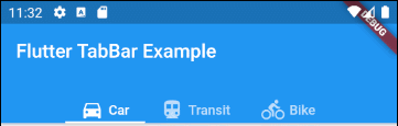
Property indicatorColor cho phép bạn chỉ định mầu sắc của đường thẳng (line) phía dưới Tab đang được lựa chọn. Property này sẽ bị bỏ qua nếu property indicator được chỉ định.
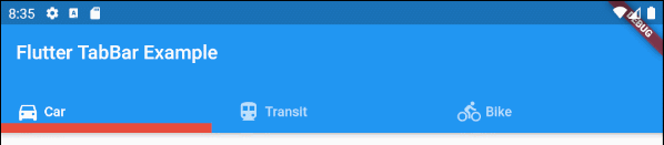
Color indicatorColorVí dụ: Sét đặt mầu đỏ cho đường thẳng (line) phía dưới Tab đang được chọn:
indicatorColor (ex1)
TabBar (
  tabs: [
    Row (children: [Icon(Icons.directions_car), SizedBox(width:5), Text("Car")]),
    Row (children: [Icon(Icons.directions_transit), SizedBox(width:5), Text("Transit")]),
    Row (children: [Icon(Icons.directions_bike), SizedBox(width:5), Text("Bike")]),
  ],
  indicatorColor: Color(0xffE74C3C),
);- Hướng dẫn và ví dụ Flutter Color
6. indicatorWeight
Property indicatorWeight được sử dụng để sét đặt độ dầy (thickness) của đường thẳng (line) bên dưới Tab đang được chọn. Giá trị của nó lớn hơn 0, và giá trị mặc định là 2. Property này sẽ bị bỏ qua nếu property indicator được chỉ định.
double indicatorWeight;Ví dụ, sét đặt độ dầy (thickness) cho đường thẳng bên dưới Tab đang được chọn.
indicatorWeight (ex1)
TabBar(
tabs: [
Row (children: [Icon(Icons.directions_car), SizedBox(width:5), Text("Car")]),
Row (children: [Icon(Icons.directions_transit), SizedBox(width:5), Text("Transit")]),
Row (children: [Icon(Icons.directions_bike), SizedBox(width:5), Text("Bike")]),
],
indicatorColor: Color(0xffE74C3C),
indicatorWeight: 10
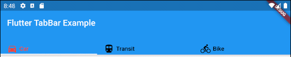
);7. indicatorPadding
Property indicatorPadding chỉ định padding theo phương ngang cho đường thẳng nằm phía dưới Tab đang được chọn.
EdgeInsetsGeometry indicatorPadding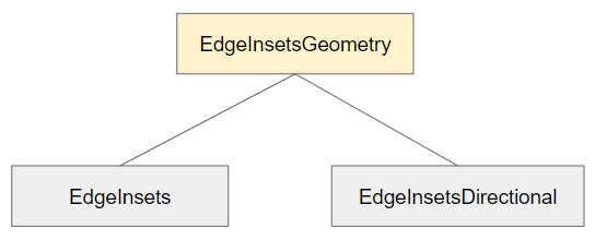
Ví dụ:
indicatorPadding (ex1)
TabBar(
  tabs: [
    Row (children: [Icon(Icons.directions_car), SizedBox(width:5), Text("Car")]),
    Row (children: [Icon(Icons.directions_transit), SizedBox(width:5), Text("Transit")]),
    Row (children: [Icon(Icons.directions_bike), SizedBox(width:5), Text("Bike")]),
  ],
  indicatorColor: Color(0xffE74C3C),
  indicatorWeight: 10,
  indicatorPadding: EdgeInsets.only(right: 20),
);
8. indicator
Property indicator cho phép bạn định nghĩa ngoại hình (appearance) của Tab đang được lựa chọn. Nếu property này được sử dụng các property khác như indicatorColor, indicatorWeight và indicatorPadding sẽ bị bỏ qua.
Decoration indicator;
Ví dụ:
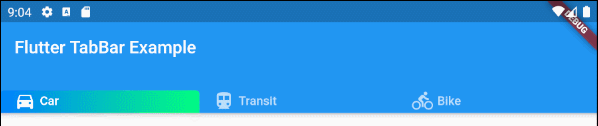
indicator (ex1)
TabBar(
  tabs: [
    Row (children: [Icon(Icons.directions_car), SizedBox(width:5), Text("Car")]),
    Row (children: [Icon(Icons.directions_transit), SizedBox(width:5), Text("Transit")]),
    Row (children: [Icon(Icons.directions_bike), SizedBox(width:5), Text("Bike")]),
  ],
  indicator: ShapeDecoration (
      shape: UnderlineInputBorder (
          borderSide: BorderSide(
              color: Colors.transparent,
              width: 0,
              style: BorderStyle.solid
          )
      ),
      gradient: LinearGradient(colors: [Color(0xff0081ff), Color(0xff01ff80)])
  )
);- Hướng dẫn và ví dụ Flutter Decoration
9. labelColor
Property labelColor được sử dụng để chỉ định mầu chữ cho nhãn (label) của Tab đang được lựa chọn
Color labelColor;Ví dụ:
TabBar(
    tabs: [
      Row (children: [Icon(Icons.directions_car), SizedBox(width:5), Text("Car")]),
      Row (children: [Icon(Icons.directions_transit), SizedBox(width:5), Text("Transit")]),
      Row (children: [Icon(Icons.directions_bike), SizedBox(width:5), Text("Bike")]),
    ],
    labelColor: Colors.red,
    unselectedLabelColor: Colors.black,
);
10. unselectedLabelColor
Property unselectedLabelColor được sử dụng để chỉ định mầu sắc nhãn (label) của các Tab không được chọn.
Color unselectedLabelColor;Ví dụ:
unselectedLabelColor (ex1)
TabBar(
  tabs: [
    Row (children: [Icon(Icons.directions_car), SizedBox(width:5), Text("Car")]),
    Row (children: [Icon(Icons.directions_transit), SizedBox(width:5), Text("Transit")]),
    Row (children: [Icon(Icons.directions_bike), SizedBox(width:5), Text("Bike")]),
  ],
  labelColor: Colors.white,
  unselectedLabelColor: Colors.cyanAccent,
);
11. labelPadding
Property labelPadding được sử dụng để thêm padding vào mỗi nhãn (label) của các Tab.
EdgeInsetsGeometry labelPadding;Ví dụ:
labelPadding (ex1)
TabBar(
  tabs: [
    Row (children: [Icon(Icons.directions_car), SizedBox(width:5), Text("Car")]),
    Row (children: [Icon(Icons.directions_transit), SizedBox(width:5), Text("Transit")]),
    Row (children: [Icon(Icons.directions_bike), SizedBox(width:5), Text("Bike")]),
  ],
  labelPadding: EdgeInsets.all( 20),
);
12. labelStyle
Property labelStyle được sử dụng để chỉ định kiểu dáng văn bản trên nhãn của các Tab đang được chọn.
TextStyle labelStyle;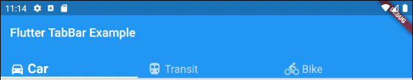
labelStyle (ex1)
TabBar(
  tabs: [
    Row (children: [Icon(Icons.directions_car), SizedBox(width:5), Text("Car")]),
    Row (children: [Icon(Icons.directions_transit), SizedBox(width:5), Text("Transit")]),
    Row (children: [Icon(Icons.directions_bike), SizedBox(width:5), Text("Bike")]),
  ],
  labelStyle: TextStyle(fontWeight: FontWeight.bold, fontSize: 22),
  unselectedLabelStyle: TextStyle(fontStyle: FontStyle.normal, fontSize: 18),
);- Hướng dẫn và ví dụ Flutter TextStyle
13. unselectedLabelStyle
Property unselectedLabelStyle được sử dụng để chỉ định kiểu dáng văn bản trên nhãn của các Tab không được chọn.
TextStyle unselectedLabelStyle;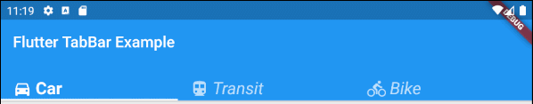
unselectedLabelStyle (ex1)
TabBar(
  tabs: [
    Row (children: [Icon(Icons.directions_car), SizedBox(width:5), Text("Car")]),
    Row (children: [Icon(Icons.directions_transit), SizedBox(width:5), Text("Transit")]),
    Row (children: [Icon(Icons.directions_bike), SizedBox(width:5), Text("Bike")]),
  ],
  labelStyle: TextStyle(fontWeight: FontWeight.bold, fontSize: 22),
  unselectedLabelStyle: TextStyle(fontStyle: FontStyle.italic),
);- Hướng dẫn và ví dụ Flutter TextStyle
14. onTap
onTap là một hàm callback sẽ được gọi khi người dùng chạm (tap) vào một Tab trên TabBar.
ValueChanged<int> onTap;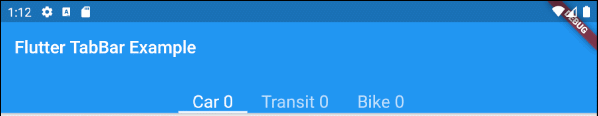
main.dart (onTap ex1)
import 'package:flutter/material.dart';

void main() {
  runApp(MyApp());
}

class MyApp extends StatelessWidget {
  // This widget is the root of your application.
  @override
  Widget build(BuildContext context) {
    return MaterialApp(
      title: 'Title of Application',
      theme: ThemeData(
        primarySwatch: Colors.blue,
        visualDensity: VisualDensity.adaptivePlatformDensity,
      ),
      home: MyHomePage(),
    );
  }
}

class MyHomePage extends StatefulWidget {
  MyHomePage({Key key}) : super(key: key);

  @override
  State<StatefulWidget> createState() {
    return MyHomePageState();
  }
}

class MyHomePageState extends State<MyHomePage> {
  int carClick = 0;
  int transitClick = 0;
  int bikeClick = 0;

  @override
  Widget build(BuildContext context) {
    return DefaultTabController(
        length: 3,
        child: Scaffold(
          appBar: AppBar(
            bottom: createTabBar(),
            title: Text('Flutter TabBar Example'),
          ),
          body: TabBarView(
            children: [
              Center(child: Text("Car")),
              Center(child: Text("Transit")),
              Center(child: Text("Bike"))
            ],
          ),
        )
    );
  }

  TabBar createTabBar()  {
    return TabBar(
        isScrollable: true,
        labelStyle: TextStyle(fontSize: 20),
        tabs: [
          Text("Car " + this.carClick.toString()),
          Text("Transit " + this.transitClick.toString()),
          Text("Bike " + this.bikeClick.toString())
        ],
        onTap: (index) {
          this.onTapHandler(index);
        }
    );
  }

  void onTapHandler(int index)  {
    setState(()  {
      switch(index){
        case 0:
          carClick++;
          break;
        case 1:
          transitClick++;
          break;
        case 2:
          bikeClick++;
          break;
      }
    });
  }

}Các hướng dẫn lập trình Flutter
- Hướng dẫn và ví dụ Flutter Column
- Hướng dẫn và ví dụ Flutter Stack
- Hướng dẫn và ví dụ Flutter IndexedStack
- Hướng dẫn và ví dụ Flutter Spacer
- Hướng dẫn và ví dụ Flutter Expanded
- Hướng dẫn và ví dụ Flutter SizedBox
- Hướng dẫn và ví dụ Flutter Tween
- Cài đặt Flutter SDK trên Windows
- Cài đặt Flutter Plugin cho Android Studio
- Tạo ứng dụng Flutter đầu tiên của bạn - Hello Flutter
- Hướng dẫn và ví dụ Flutter Scaffold
- Hướng dẫn và ví dụ Flutter AppBar
- Hướng dẫn và ví dụ Flutter BottomAppBar
- Hướng dẫn và ví dụ Flutter SliverAppBar
- Hướng dẫn và ví dụ Flutter TextButton
- Hướng dẫn và ví dụ Flutter ElevatedButton
- Hướng dẫn và ví dụ Flutter ShapeBorder
- Hướng dẫn và ví dụ Flutter EdgeInsetsGeometry
- Hướng dẫn và ví dụ Flutter EdgeInsets
- Hướng dẫn và ví dụ Flutter CircularProgressIndicator
- Hướng dẫn và ví dụ Flutter LinearProgressIndicator
- Hướng dẫn và ví dụ Flutter Center
- Hướng dẫn và ví dụ Flutter Align
- Hướng dẫn và ví dụ Flutter Row
- Hướng dẫn và ví dụ Flutter SplashScreen
- Hướng dẫn và ví dụ Flutter Alignment
- Hướng dẫn và ví dụ Flutter Positioned
- Hướng dẫn và ví dụ Flutter ListTile
- Hướng dẫn và ví dụ Flutter SimpleDialog
- Hướng dẫn và ví dụ Flutter AlertDialog
- Navigation và Routing trong Flutter
- Hướng dẫn và ví dụ Flutter Navigator
- Hướng dẫn và ví dụ Flutter TabBar
- Hướng dẫn và ví dụ Flutter Banner
- Hướng dẫn và ví dụ Flutter BottomNavigationBar
- Hướng dẫn và ví dụ Flutter FancyBottomNavigation
- Hướng dẫn và ví dụ Flutter Card
- Hướng dẫn và ví dụ Flutter Border
- Hướng dẫn và ví dụ Flutter ContinuousRectangleBorder
- Hướng dẫn và ví dụ Flutter RoundedRectangleBorder
- Hướng dẫn và ví dụ Flutter CircleBorder
- Hướng dẫn và ví dụ Flutter StadiumBorder
- Hướng dẫn và ví dụ Flutter Container
- Hướng dẫn và ví dụ Flutter RotatedBox
- Hướng dẫn và ví dụ Flutter CircleAvatar
- Hướng dẫn và ví dụ Flutter TextField
- Hướng dẫn và ví dụ Flutter IconButton
- Hướng dẫn và ví dụ Flutter FlatButton
- Hướng dẫn và ví dụ Flutter SnackBar
- Hướng dẫn và ví dụ Flutter Drawer
- Ví dụ Flutter Navigator pushNamedAndRemoveUntil
- Hiển thị hình ảnh trên Internet trong Flutter
- Hiển thị ảnh Asset trong Flutter
- Flutter TextInputType các kiểu bàn phím
- Hướng dẫn và ví dụ Flutter NumberTextInputFormatter
- Hướng dẫn và ví dụ Flutter Builder
- Làm sao xác định chiều rộng của Widget cha trong Flutter
- Bài thực hành Flutter thiết kế giao diện màn hình đăng nhập
- Bài thực hành Flutter thiết kế giao diện trang (1)
- Khuôn mẫu thiết kế Flutter với các lớp trừu tượng
- Bài thực hành Flutter thiết kế trang Profile với Stack
- Bài thực hành Flutter thiết kế trang profile (2)
- Hướng dẫn và ví dụ Flutter ListView
- Hướng dẫn và ví dụ Flutter GridView
- Bài thực hành Flutter với gói http và dart:convert (2)
- Bài thực hành Flutter với gói http và dart:convert (1)
- Ứng dụng Flutter Responsive với Menu Drawer
- Flutter GridView với SliverGridDelegate tuỳ biến
- Hướng dẫn và ví dụ Flutter image_picker
- Flutter upload ảnh sử dụng http và ImagePicker
- Hướng dẫn và ví dụ Flutter SharedPreferences
- Chỉ định cổng cố định cho Flutter Web trên Android Studio
- Tạo Module trong Flutter
- Hướng dẫn và ví dụ Flutter SkeletonLoader
- Hướng dẫn và ví dụ Flutter Slider
- Hướng dẫn và ví dụ Flutter Radio
- Bài thực hành Flutter SharedPreferences
- Hướng dẫn và ví dụ Flutter InkWell
- Hướng dẫn và ví dụ Flutter GetX GetBuilder
- Hướng dẫn và ví dụ Flutter GetX obs Obx
- Hướng dẫn và ví dụ Flutter flutter_form_builder
- Xử lý lỗi 404 trong Flutter GetX
- Flutter BloC cho người mới bắt đầu
- Ví dụ đăng nhập và đăng xuất với Flutter Getx
- Hướng dẫn và ví dụ Flutter multi_dropdown
Show More